Dec 2022 - Feb 2023
Dashboard Design
Product Development

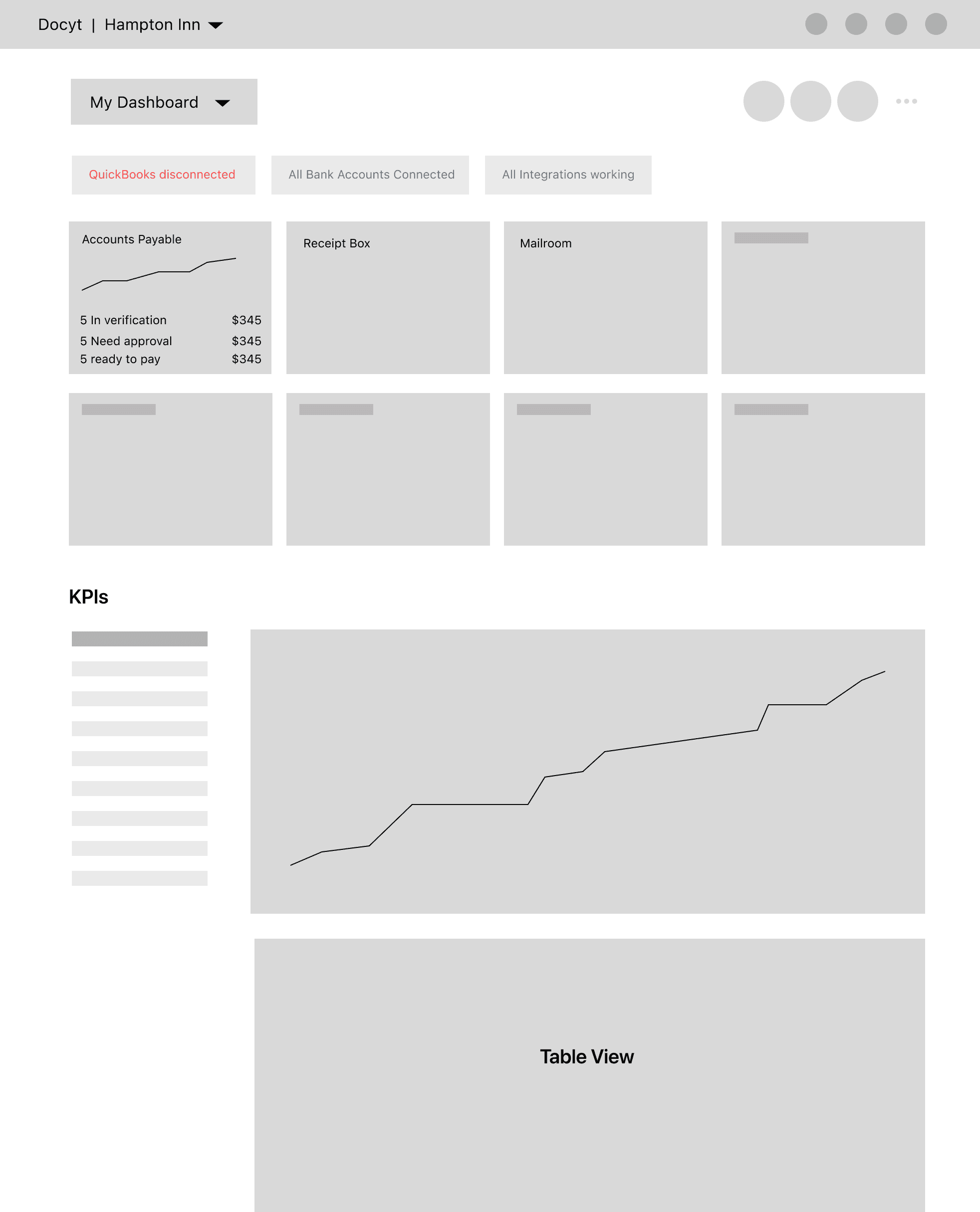
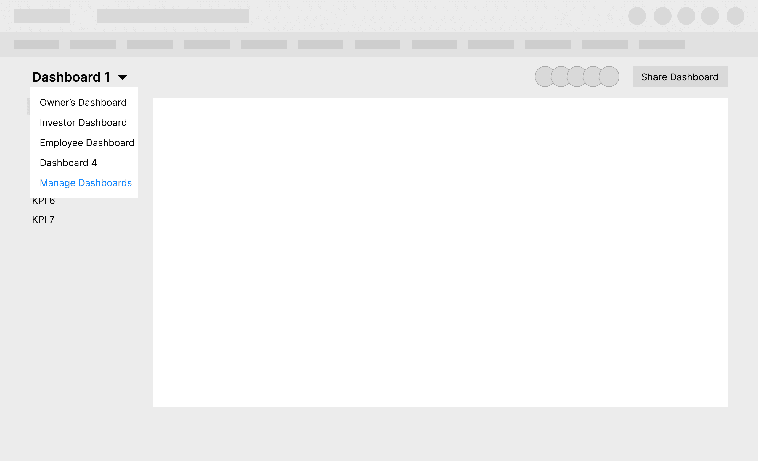
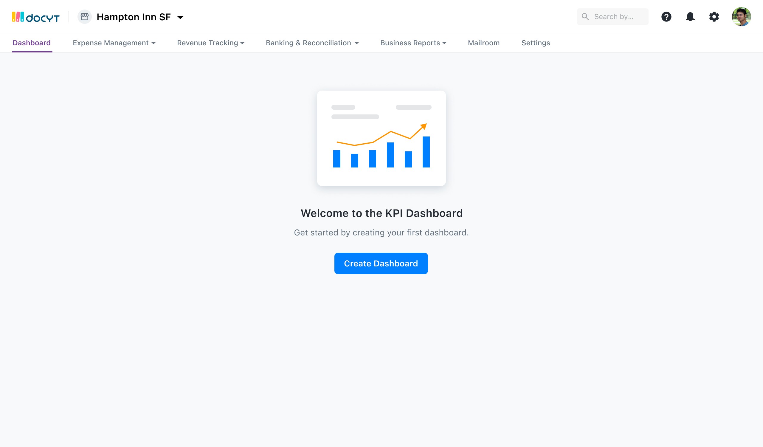
Dashboard: KPI Portal
A portal to customize KPI’s to send to different personas (stakeholder, employee, investor).
ABOUT PROBLEM
KEY REQUIREMENTS
COMPETITORS
IDEATION
Understanding the problem
MVP required use cases
Competitive analysis
Sketches and lo-fi exploration
Business Admins need the ability to view live information for their businesses and create customizable dashboards they can share with multiple personas (stakeholder, operator, investor).
In order to provide the real data access and improve the sales, it became prerequisite to improve the user satisfaction by providing a great user experience, self-service processes, that work faster and more efficient.
Competitors like Hello GM are providing the KPIs to their users through “Operator Dashboard” emails. In addition, many of our customers are integrating with apps such as Saasgrid or Bare Metrics to better understand their company's KPI performance.
Created different iterations to get the feedback based on the understanding so far. Explained each iteration on Loom
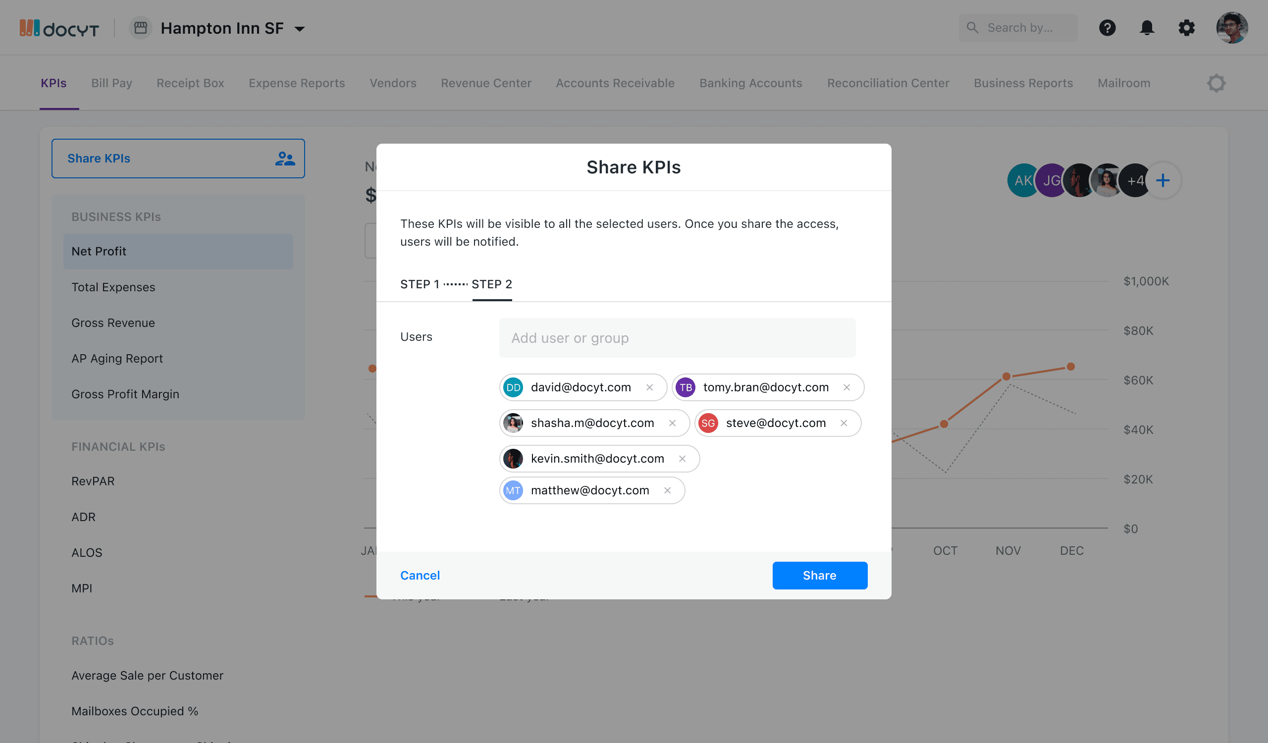
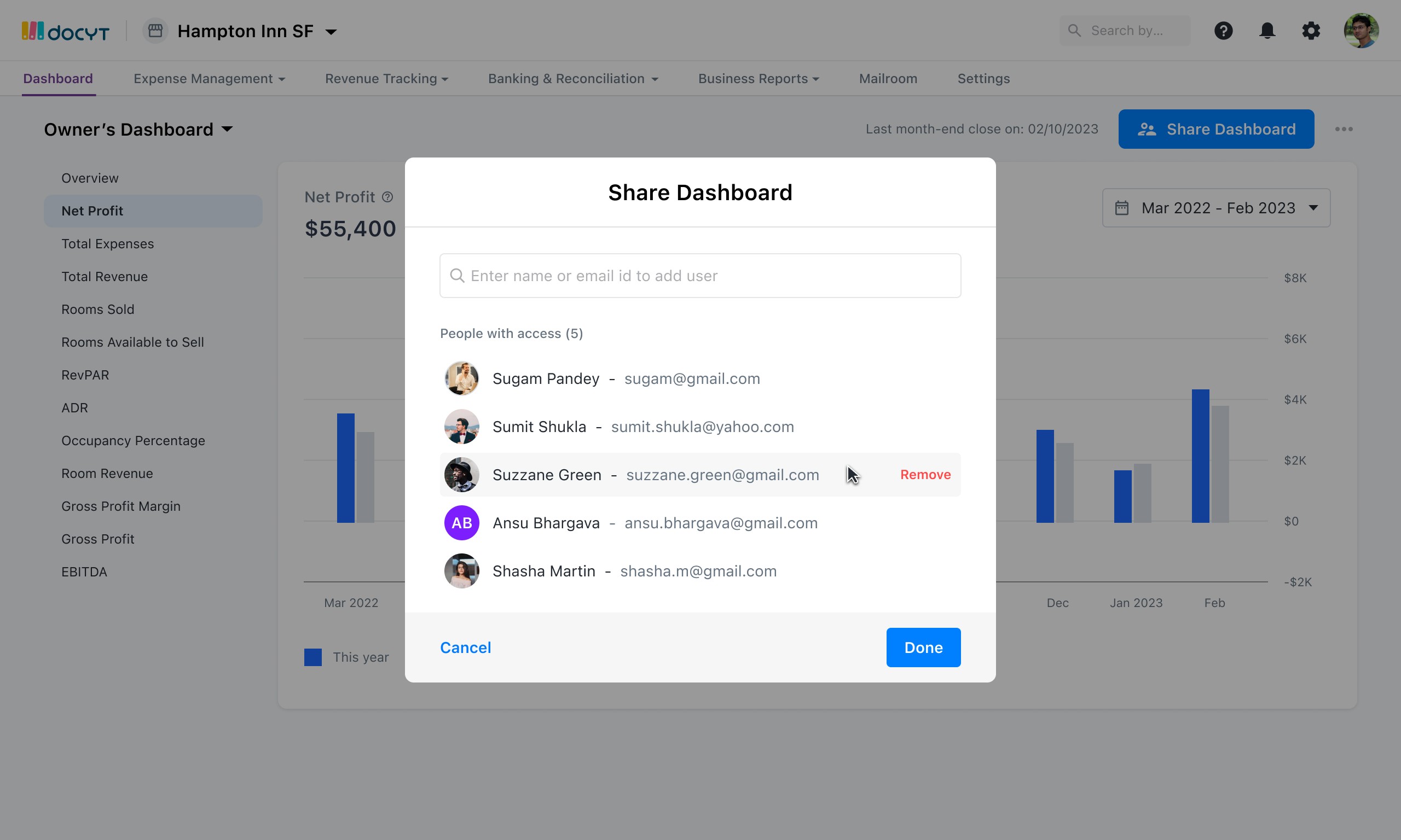
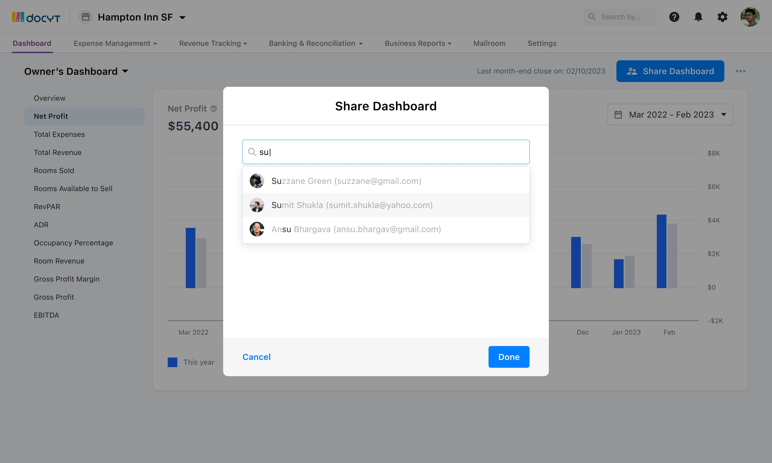
The user needs to be able to invite an investor and give them specific access to view certain KPI’s of the business.
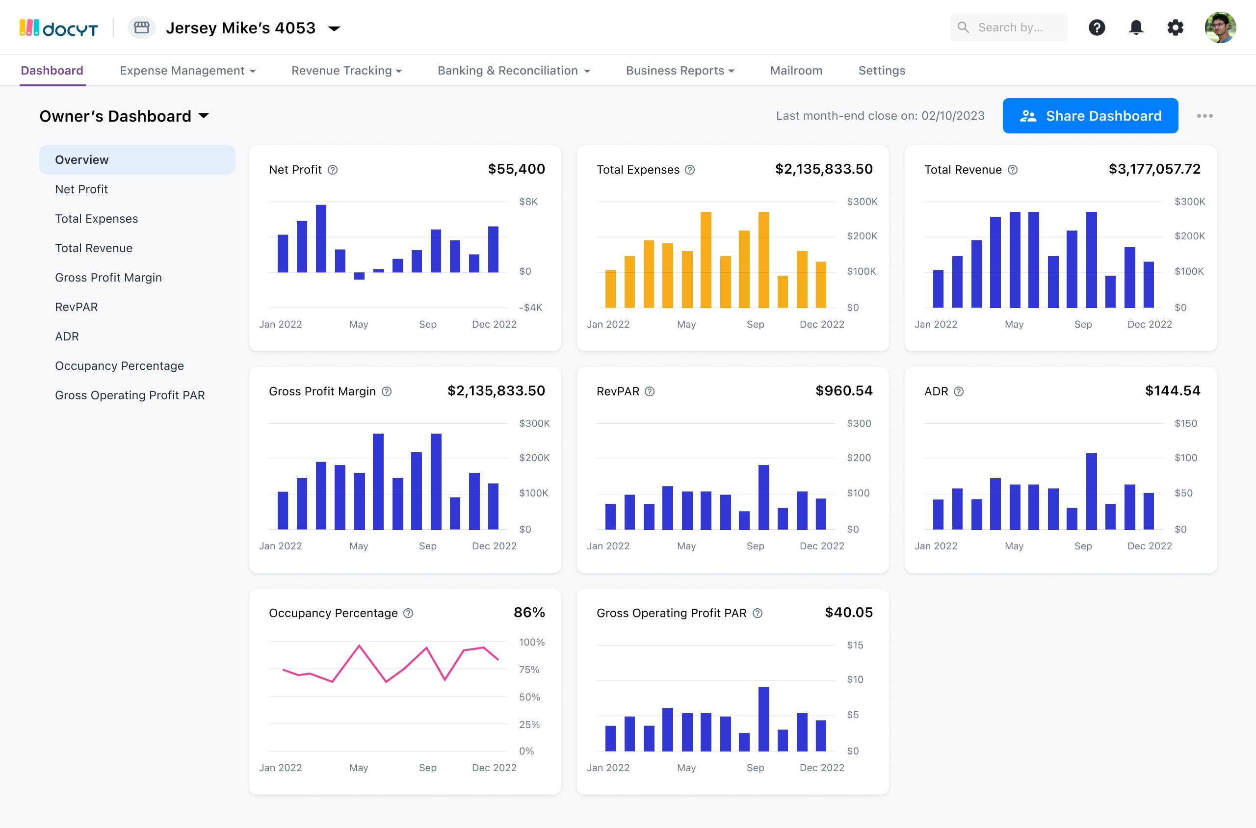
User needs to view all of their business metrics for one specific business in one place.
User needs to be able to invite non-Docyt users to view this KPI Business Dashboard with specific access control.
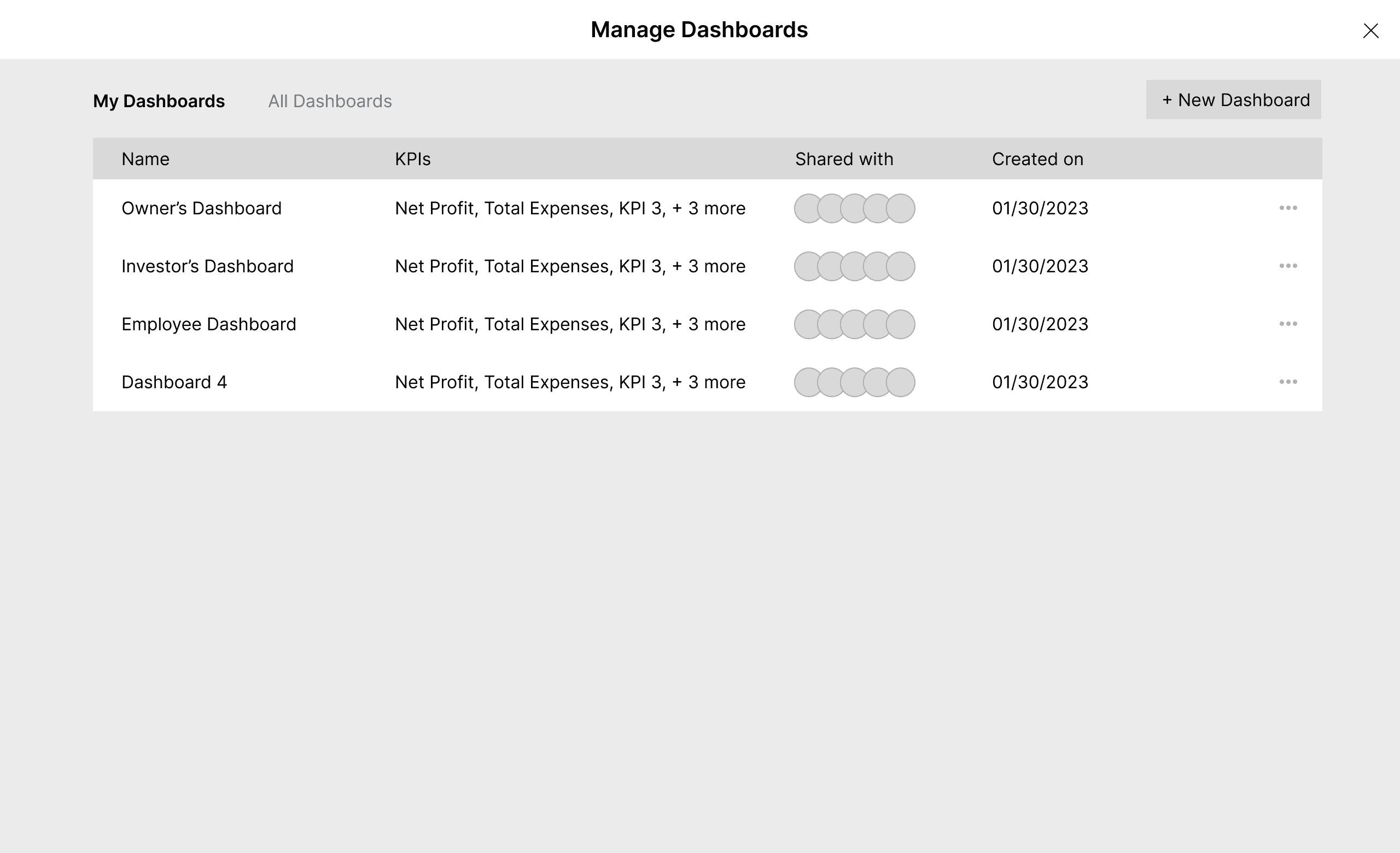
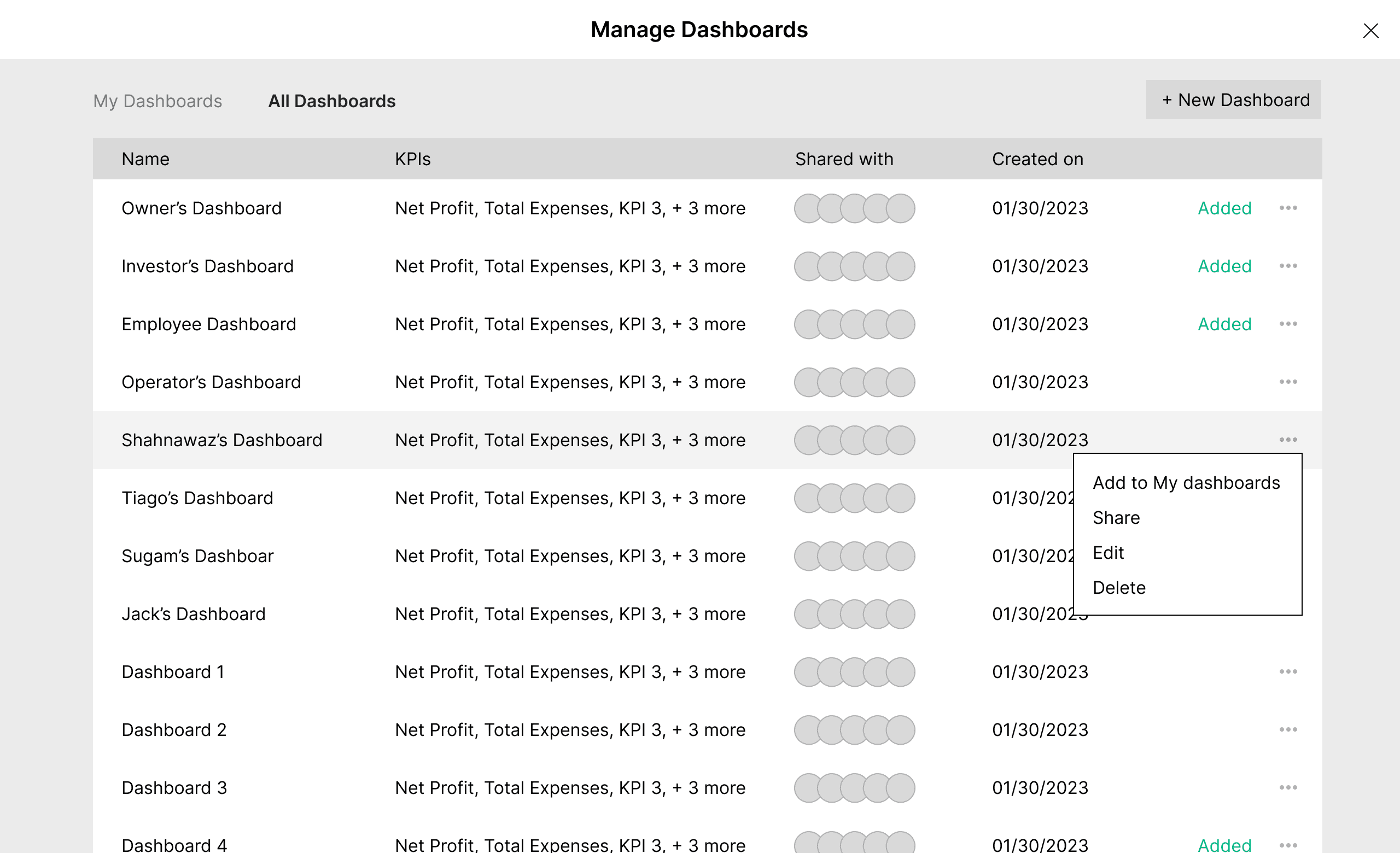
The user needs to be able to change access control for different Docyt and Non-docyt users.
The user needs to have different pre-sets for different sets of invitees.
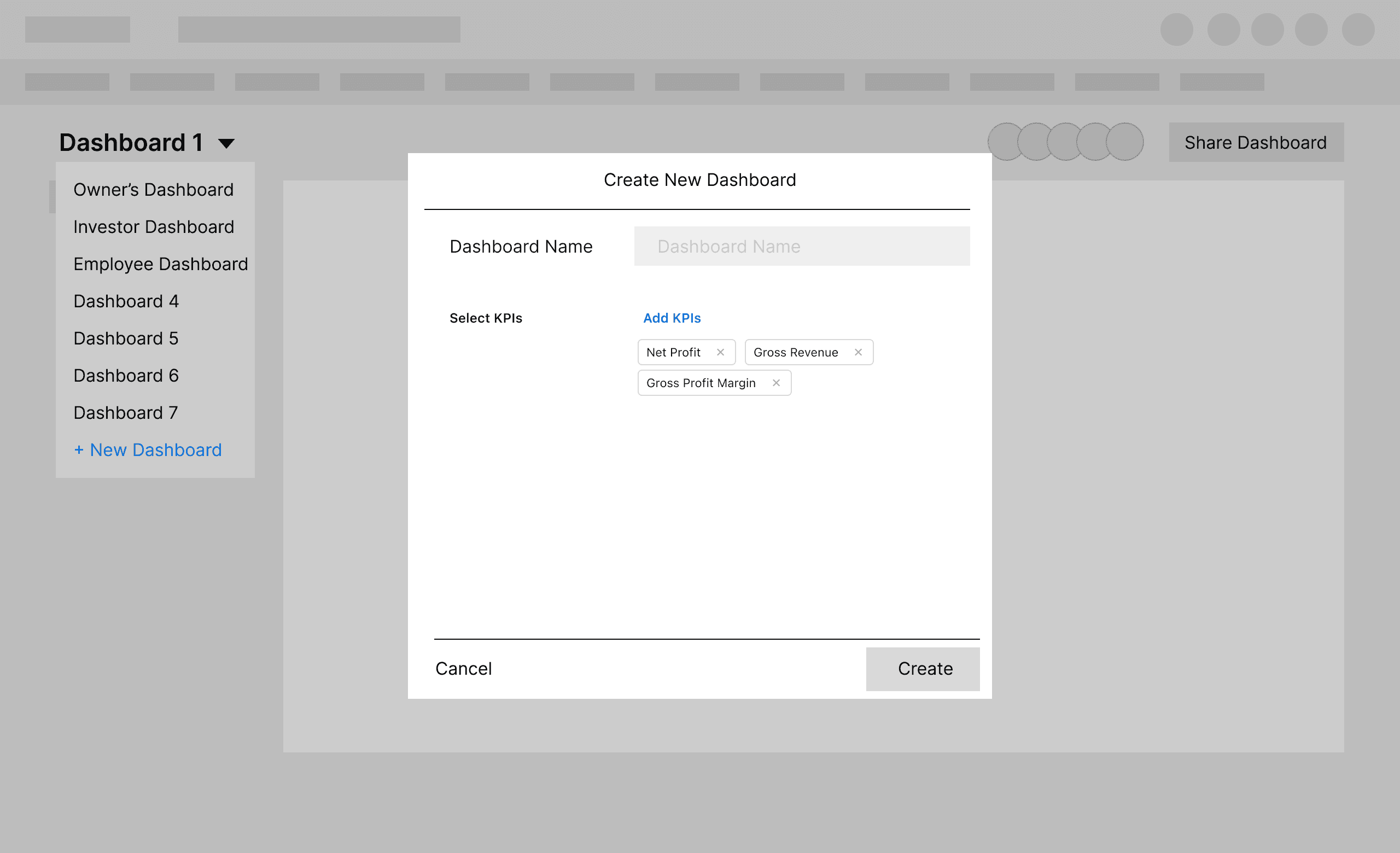
The user needs to be able group users and assign them to a pre-set dashboard with specific KPI’s.
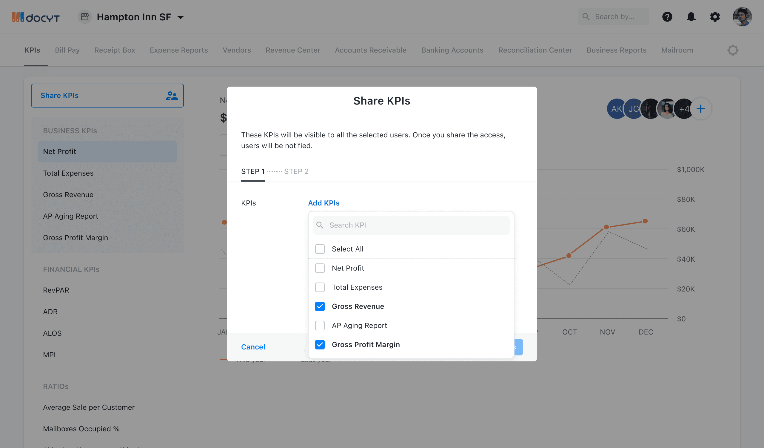
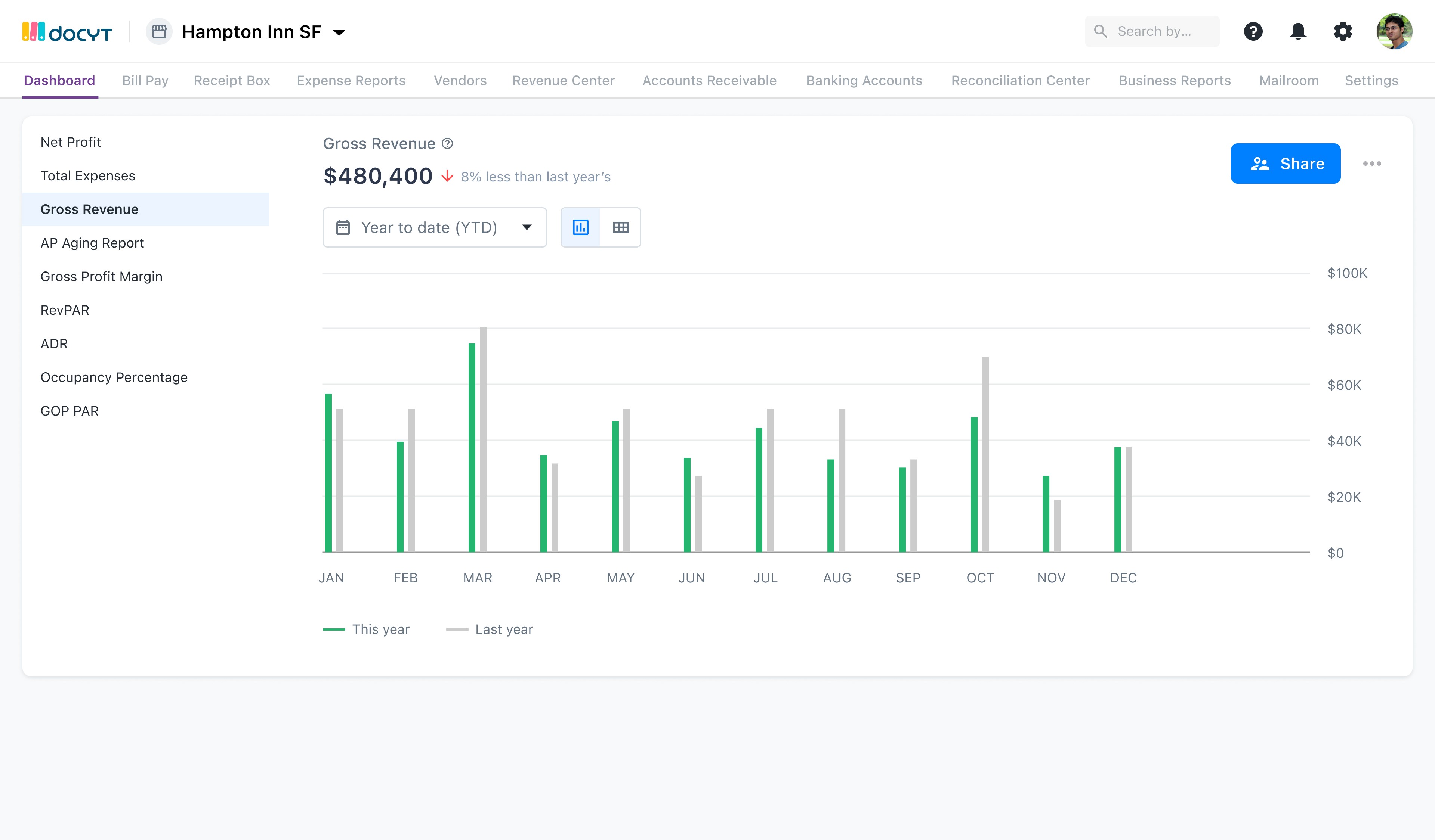
Display the metrics to choose from in a left navigation on the KPI Dashboard
This list would be limited on specific access control for the users.
Only display one metric at one time in the main screen
For every metic display a chart or graph that shows the progression of this metric.
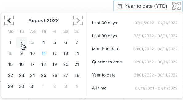
Display every metric in a YTD display.
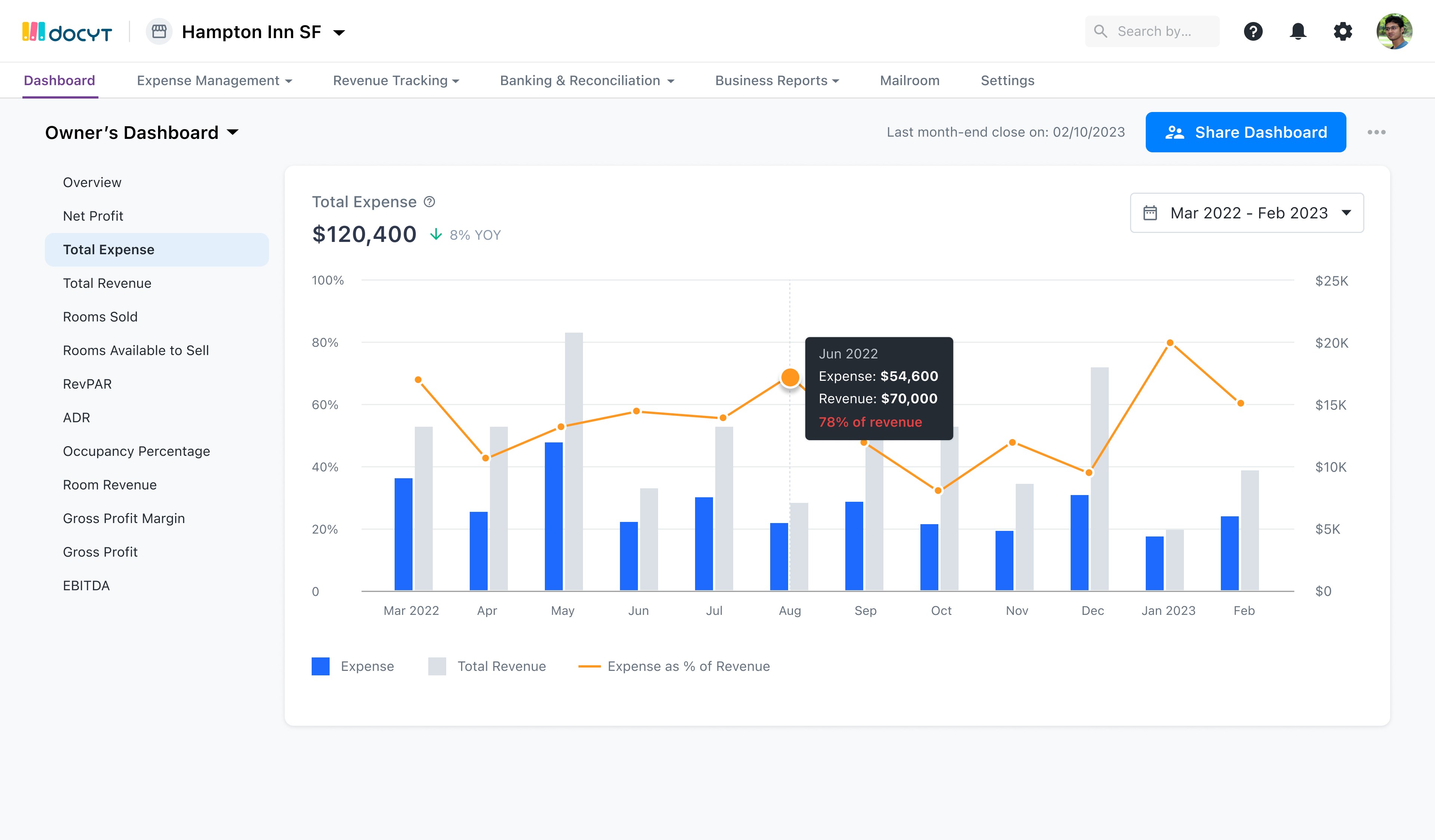
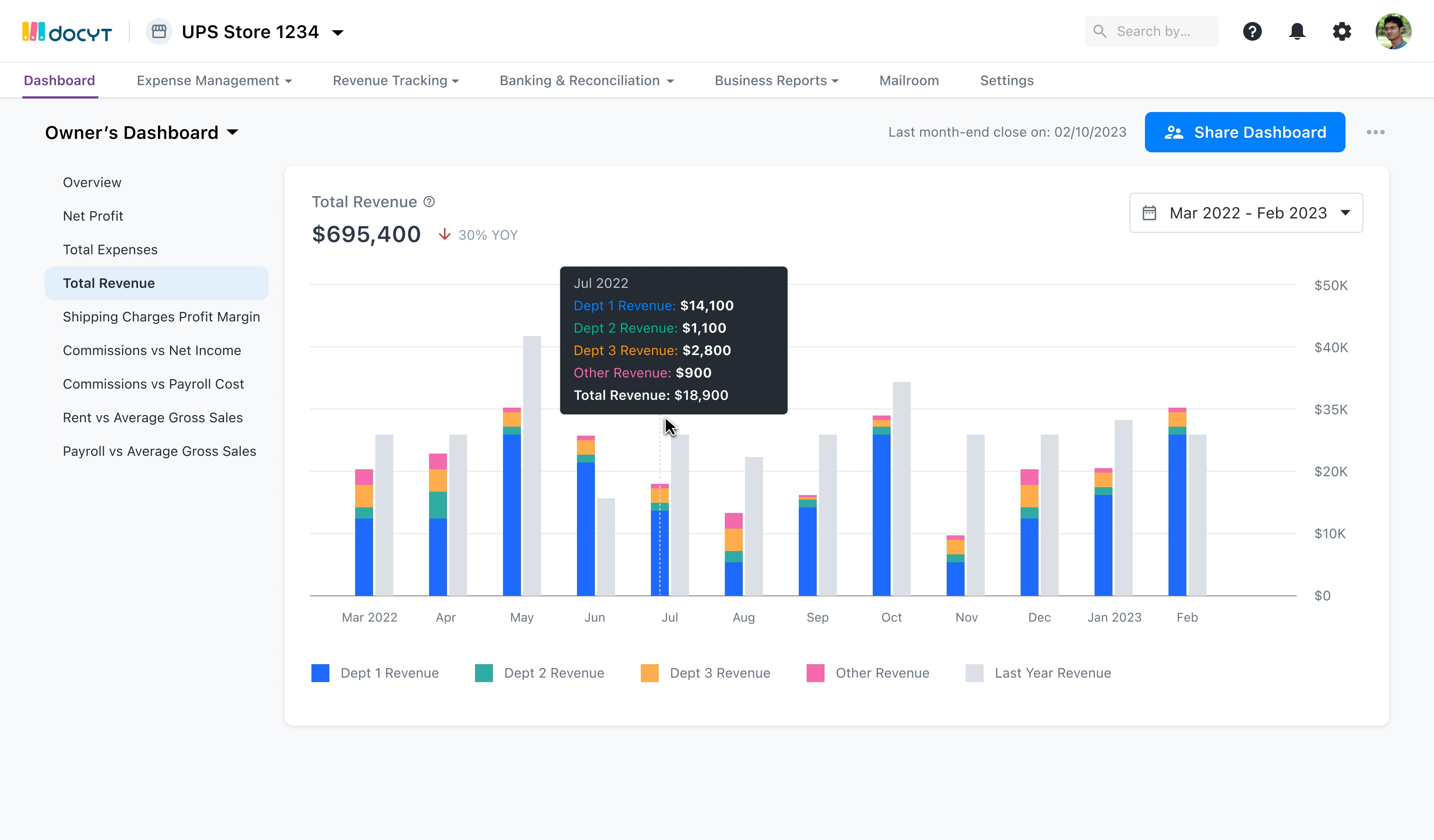
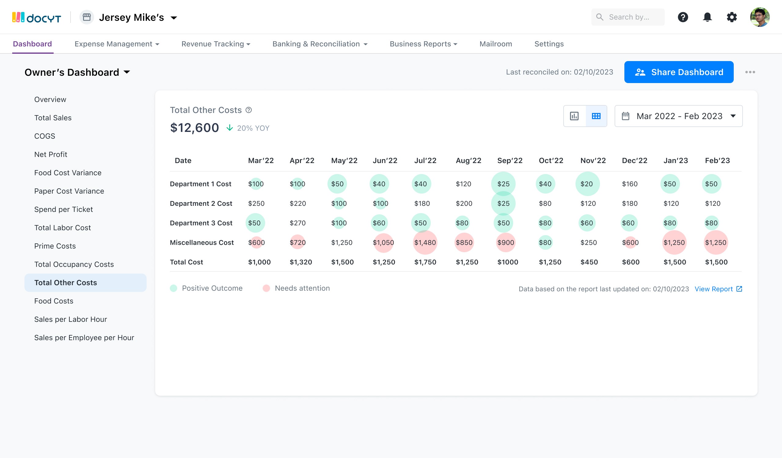
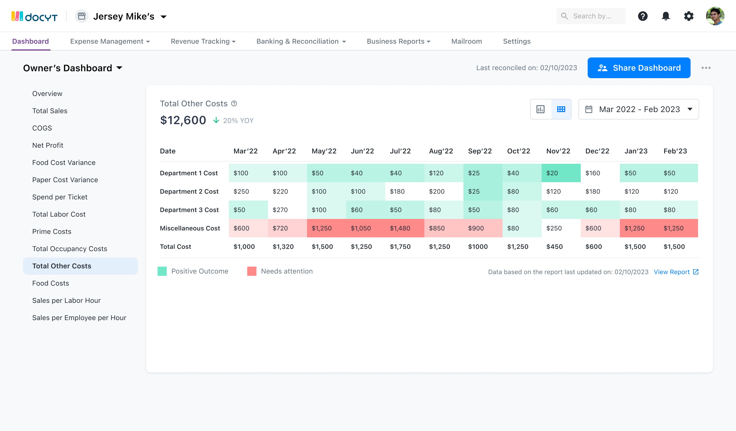
Net Profit - Gross Revenue - Expenses
Total Expenses - Cost of Goods Sold + Salaries + Sales Commissions + Marketing Costs + Real Estate Expenses + Utilities
Gross Revenue - Total of Revenue YTD
AP Aging Report - How Long your Invoices go Unpaid
Gross Profit Margin - Revenue – COGS)/Revenue x 100
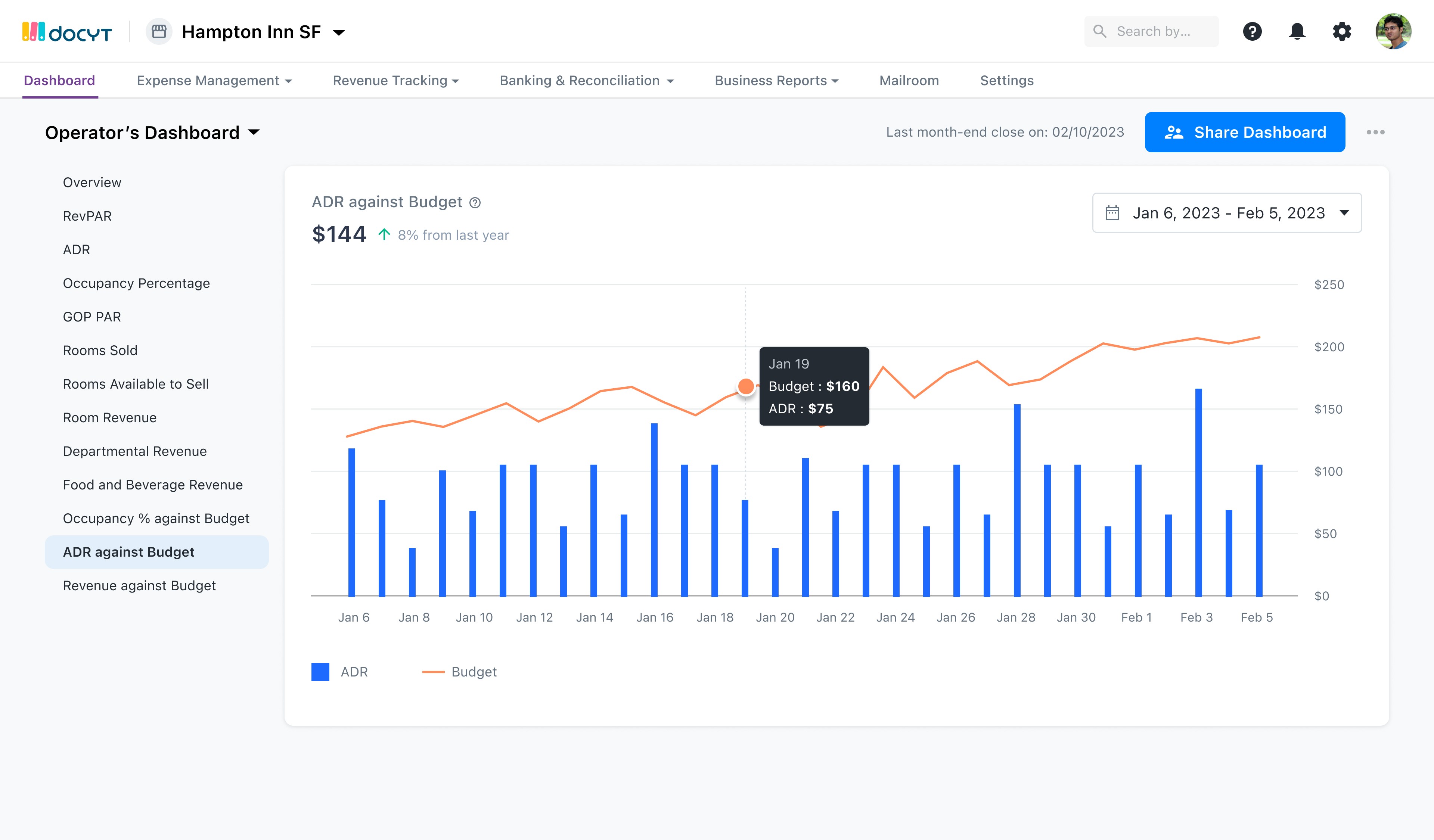
RevPAR - average daily rate x occupancy rate or total revenue from night / total number of rooms available
ADR - room revenue / number of rooms sold (occupied)
Occupancy Percentage - total number of occupied rooms / total number of available rooms x 100
ALOS - Average Length of Stay
MPI - hotel occupancy % / market occupancy % x 100 (MVP +1)
GOP PAR - Gross Operating Profit per Available Room
Marketing Cost per Booking - The average marketing cost per room booking (MVP +1)
Average Customer Count per day in the month
Average Sale per customer in the month
Percentage of mailboxes occupied (available in excel files to download via our FRS revenue integration)
Average mailbox revenue per occupied mailbox (Mailbox revenue / #occupied mailboxes)
Shippings charges (UPS) per month (available in excel files to download via our FRS revenue integration)
Shipping charges (UPS) per shipping ("Shipping Charges COGS" / # shipping charges)
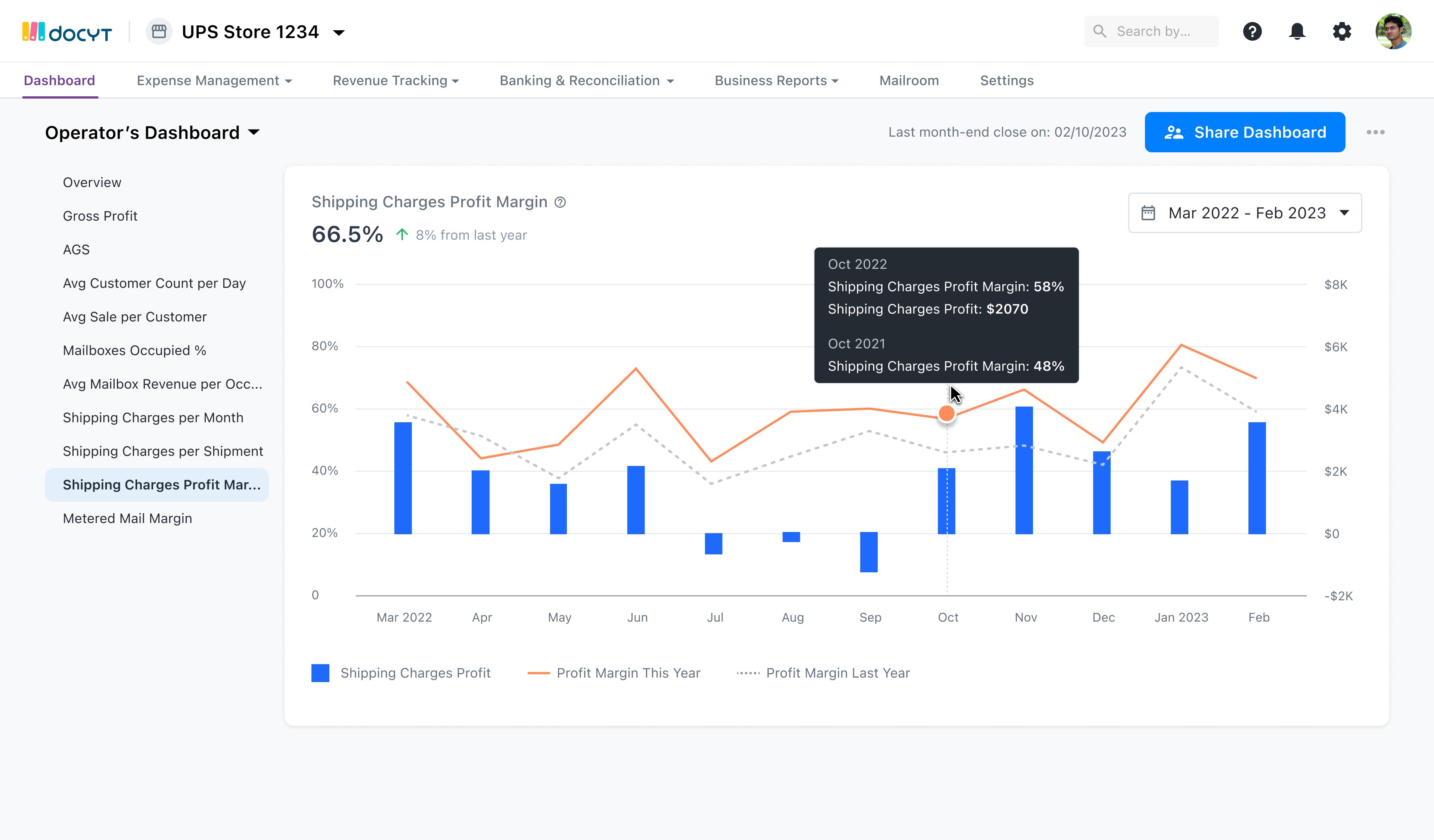
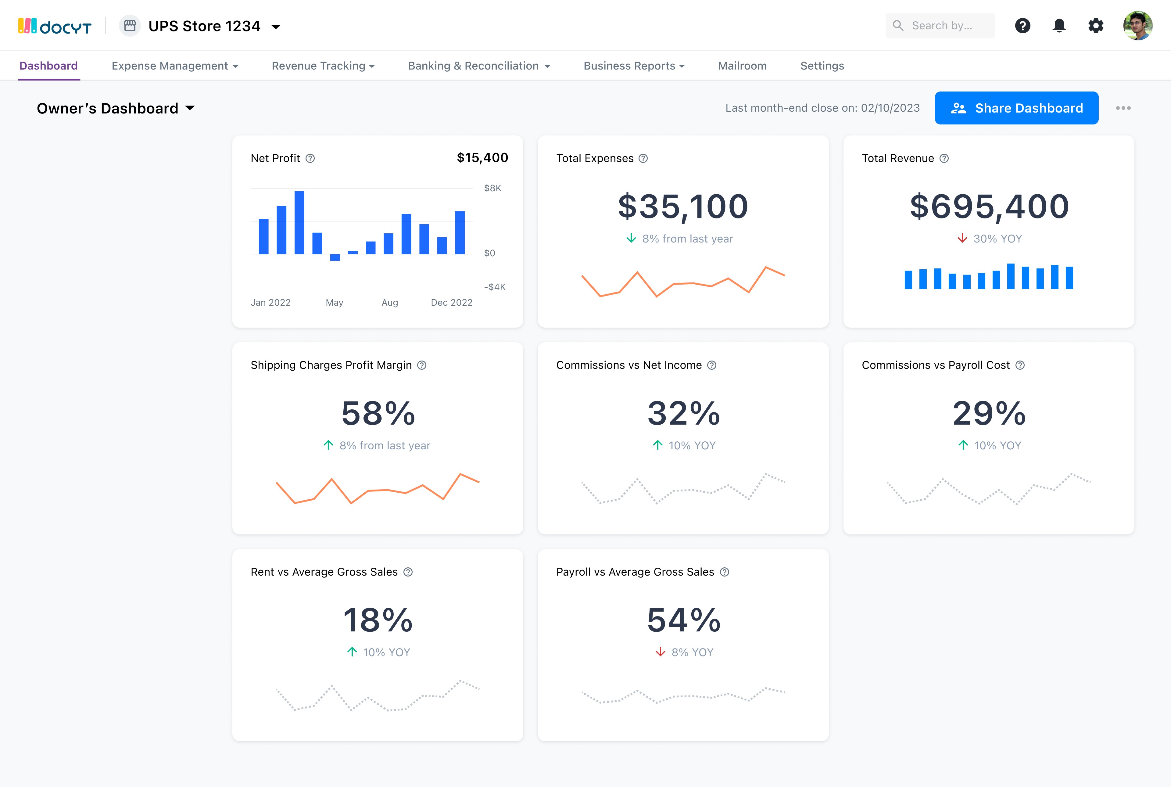
Shipping charges profit margin (calculate using "Shipping Charges Revenue", "Shipping Charges COGS")
Total Commissions versus Net Income ("Commissions Revenue" / "Net Income") - they want to see this to see how their commissions coming from franchise corporate partnerships stack up into their Net Income to assess the value of paying royalty to the UPS Corporate franchise
total Commissions / total payroll cost ("Commission Revenue" / "Payroll costs") - they want to see if commissions pays off their entire payroll
Metered mail margin - (calculate using "Metered Mail COGS", "Metered Mail revenue")
Rent versus Average Gross Sales
Payroll vs Average Gross Sales
Display these metrics for all business types.
Display these metrics for all hospitality business types.
Display these metrics for all UPS Businesses. (MVP + 1)
A few competitors that we studied and explored a few react libraries for the engineers
https://nivo.rocks/componentsI : a large library and many well designed chart
https://airbnb.io/visx
https://recharts.org/en-US/
https://uber.github.io/react-vis/examples/showcases/plots
Core requirements of component library:
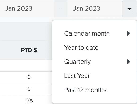
Filtering, the graphs should be able to be filtered by timeframe, additional information, potentially filter by x and y axis
We need to be able to change the colors of the graphs and charts to match Docyt UI
The header where these things can be changed
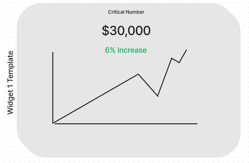
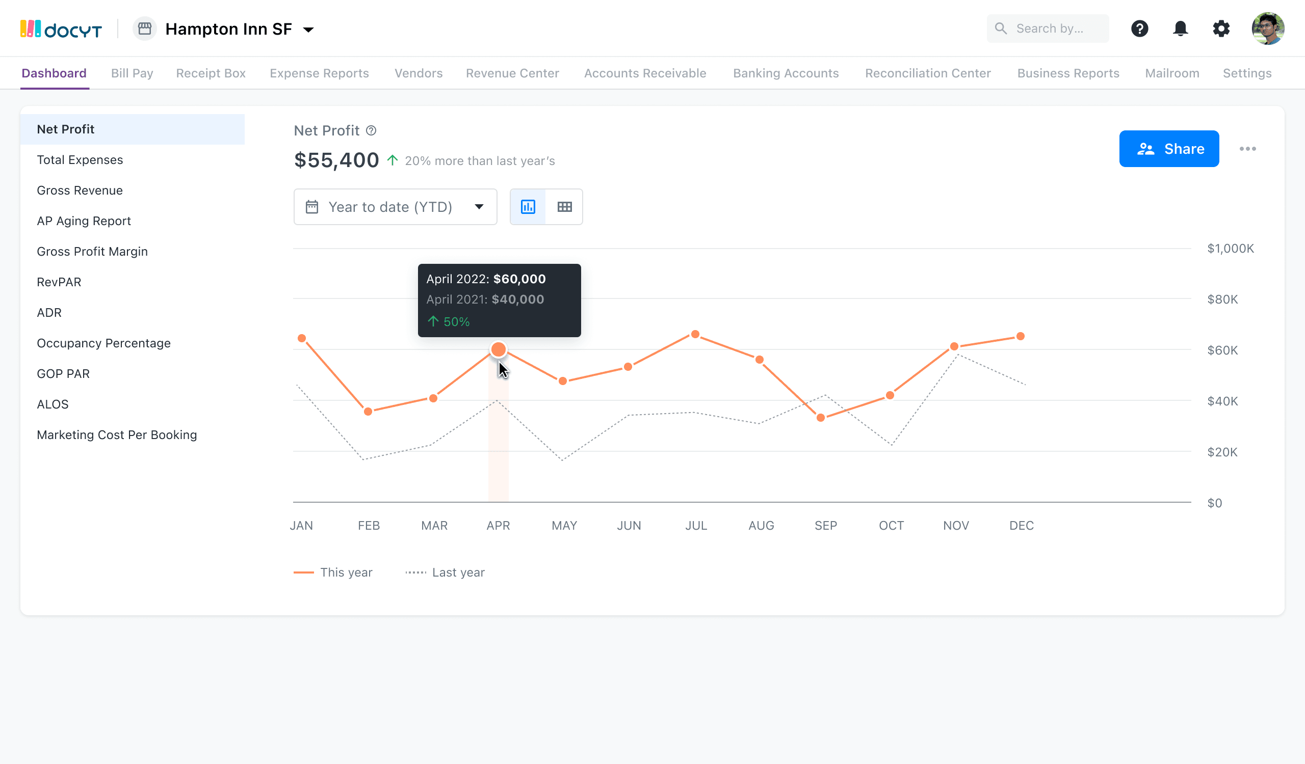
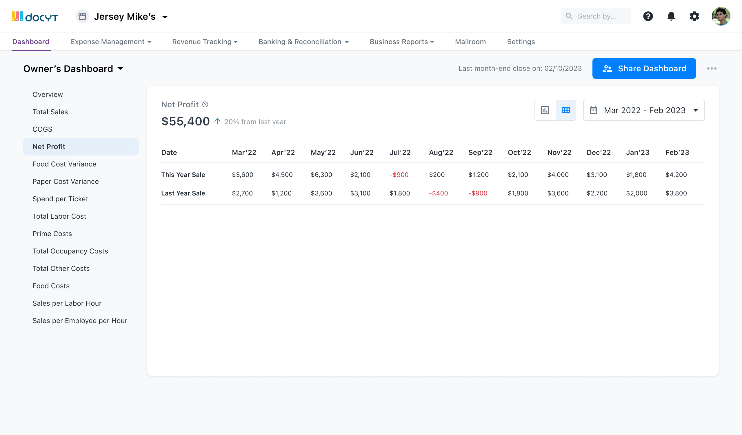
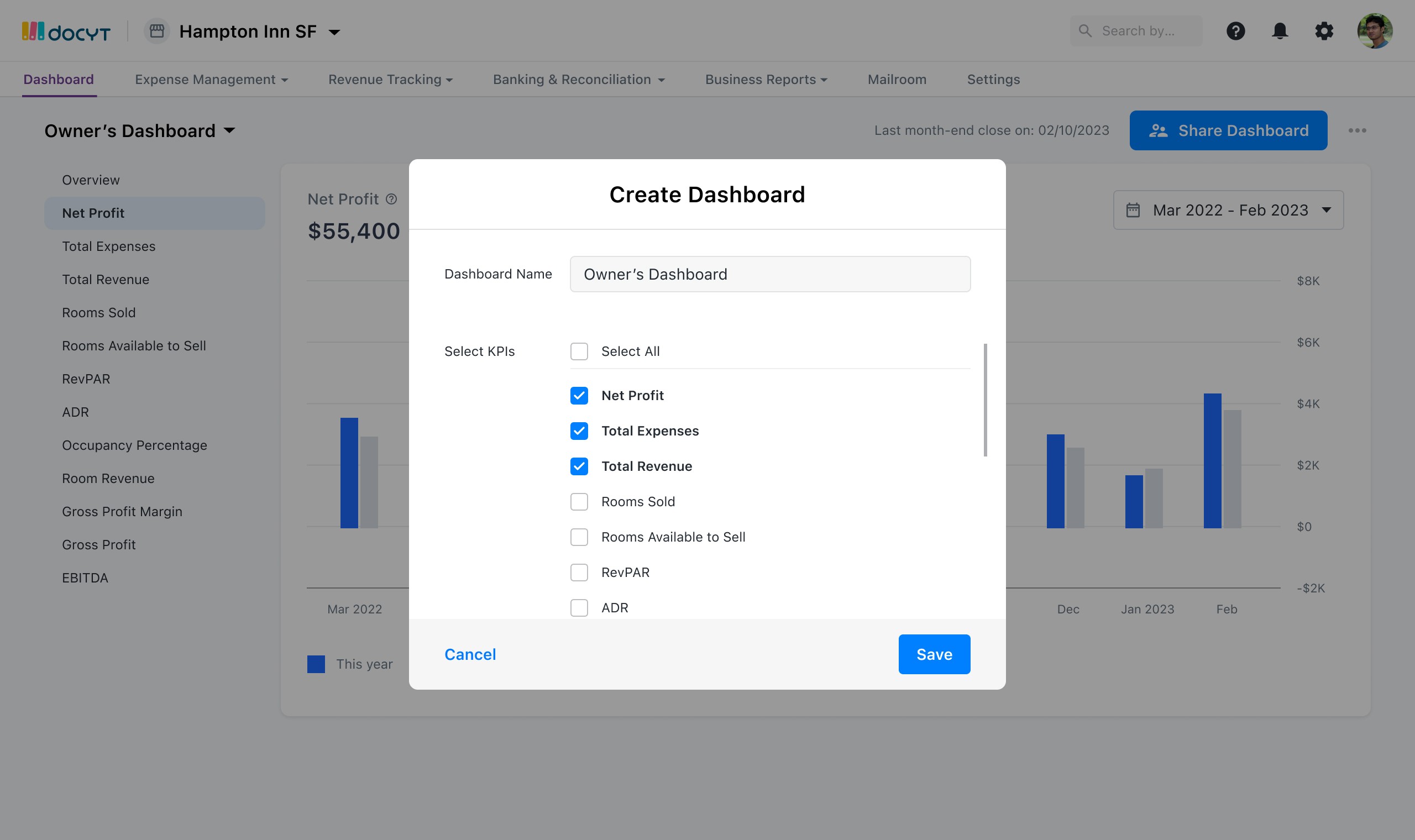
Use: This template will be used to visualize a line graph KPI at a glance in the overview widget view for the dashboard.
Items: This widget has four main components to visualize the KPI:
Title: The name of the KPI.
Total: The Total amount for the KPI for the Period.
Line Graph: Displaying the Progress of the KPI for the selected period.
Percentage Change: Displaying the percentage change for the KPI from the previous period. (Red or Green for increase or decrease.)
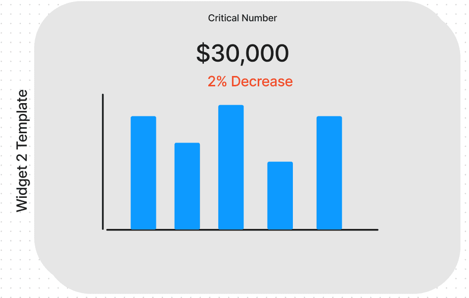
Use: This template will be used to visualize a bar and line chart to view multiple KPI’s at a glance in the overview widget view for the dashboard.
Items: This widget has four main components to visualize the KPI:
Title: The name of the KPI.
Total: The Total amount for each KPI in the display
Line Graph / Bar Chart Displaying all off the KPI’s that are included in the widget.
Share KPIs with users
Dashboard experience:
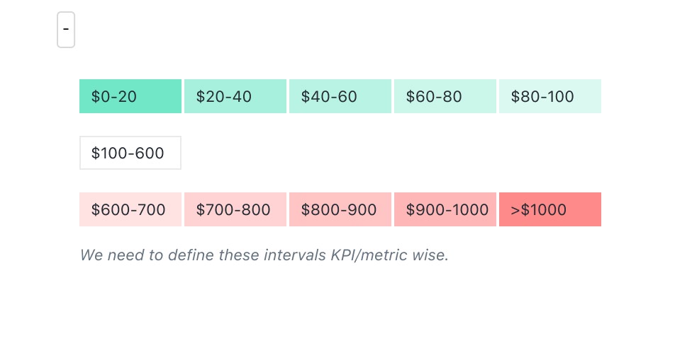
Provide option on each KPI to set an upper threshold and lower threshold limits. Whenever a KPI drops or exceeds these thresholds user will want to be notified. These limits are essentially helping do some month end checks for the business to see where things are getting out of bounds for them to pay attention
Show the "Last month end close: Oct 31, 2022".
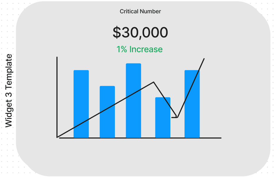
Use: This template will be used to visualize a bar chart KPI at a glance in the overview widget view for the dashboard.
Items: This widget has four main components to visualize the KPI:
Title: The name of the KPI.
Total: The Total amount for the KPI for the Period.
Bar Graph: Displaying the Progress of the KPI for the selected period.
Percentage Change: Displaying the percentage change for the KPI from the previous period. (Red or Green for increase or decrease.)
The user wants employees to be in charge of certain business KPI’s they need to give the employee access without allowing them to see all numbers.
The user wants to hold their business manager accountable for certain KPI’s but they don’t want to share more financial information
Use case 1: Investor Report
Use-cases for MVP:
Design Requirements:
General Metrics
Hospitality Metrics
UPS Metrics
Competitors and react library
Template 1: Line Chart
Template 3: Multiple KPI
Some experience to solve:
Template 2: Bar Chart
Use case 3: Employee KPI
Use case 2: Business Manager KPI

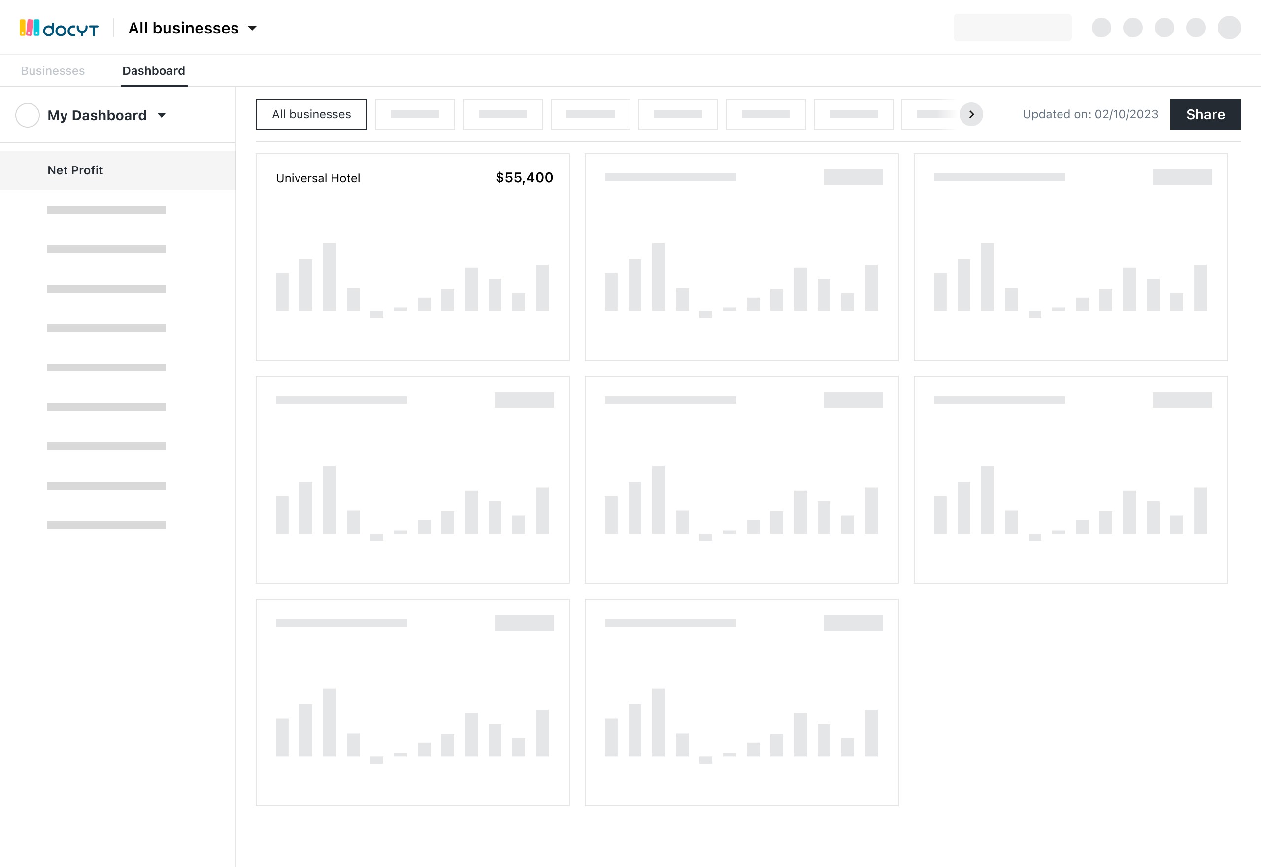
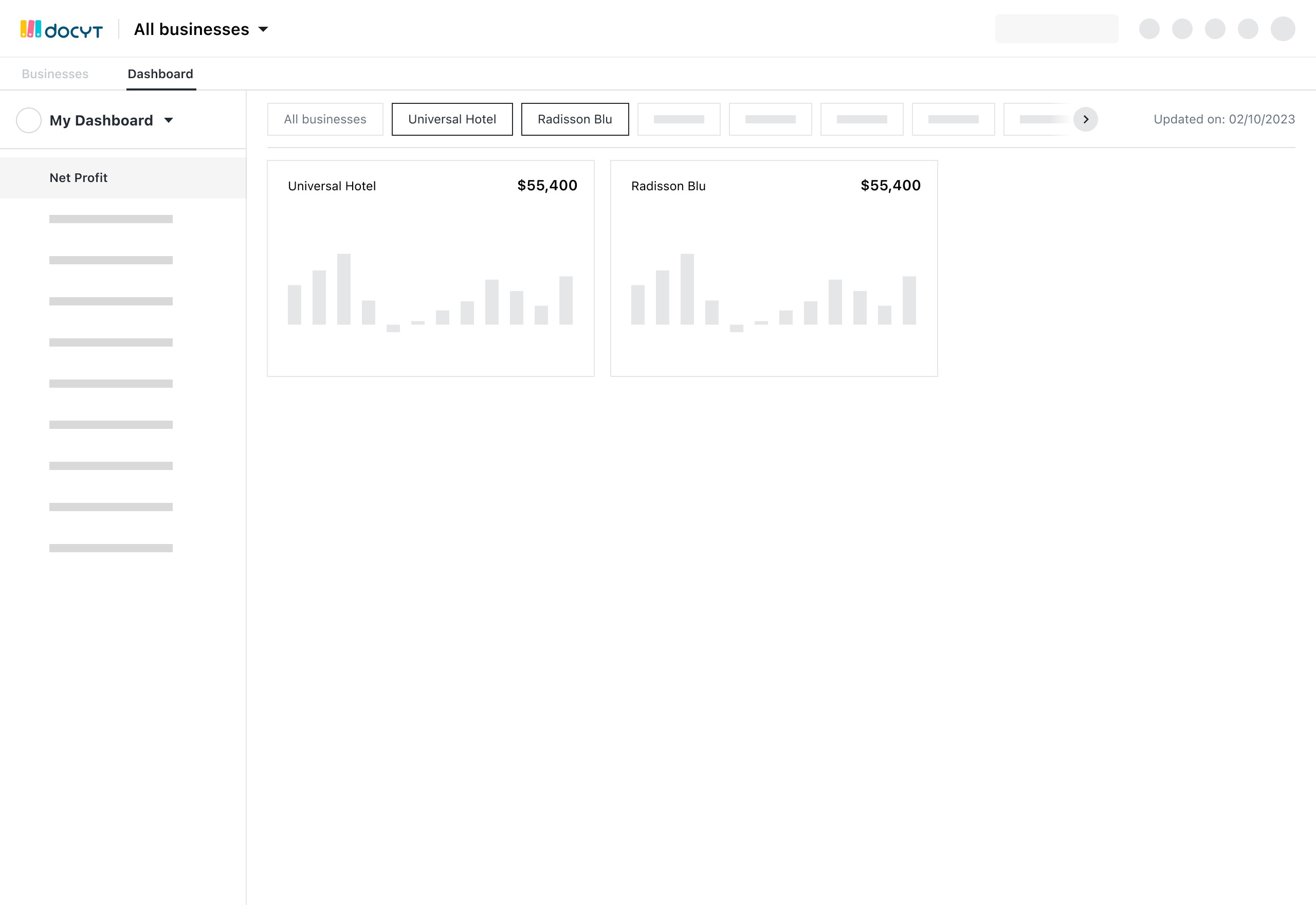
Launch point is the list of modules or the KPIs column in business list dashboard.
Overview of my business’s health (financials, KPIs etc)
Creating and sharing a custom Dashboard
Launch point is Business name on Business list dashboard.
What needs user’s attention (issues, tasks etc)
Overview of my business’s health (financials, KPIs etc)
Creating and sharing a custom Dashboard
During our sales process, the business owner is a key decision maker
As of now we don’t have “Business KPI dashboard” , in which the business owner would be able to see the health of the business and make decisions based on that
KPI dashboard will provide a reason for business owners login to Docyt everyday and make it part of their day-to-day processes
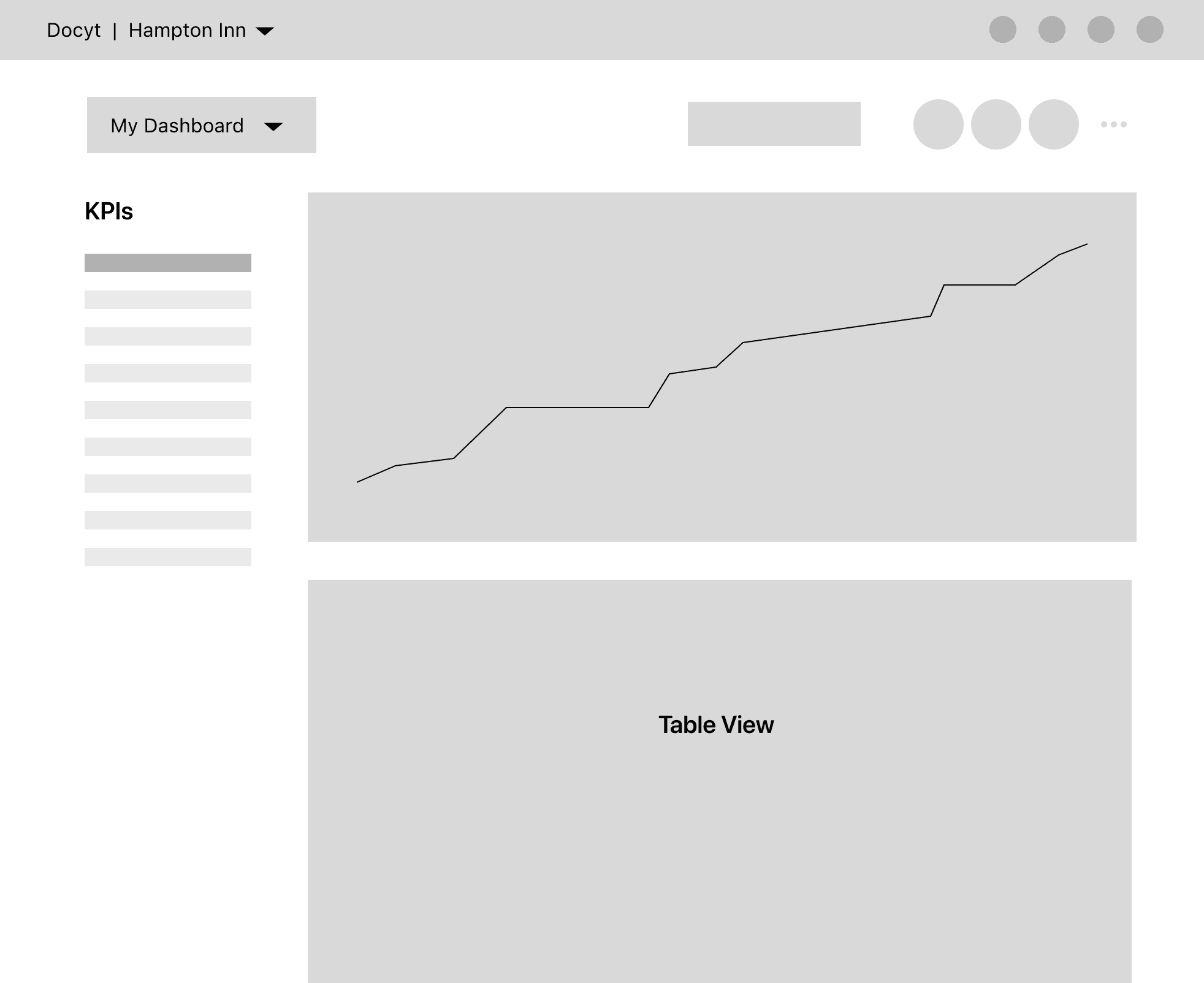
It is important that the user only views one KPI at a time, this way the data can be in the forefront of the users attention.
We want to move away from showing the business issues (QBO Disconnection, PMS Disconnection, etc.) because these will all be replicated on the "My Businesses Dashboard"
Some decision making feedback on iterations:
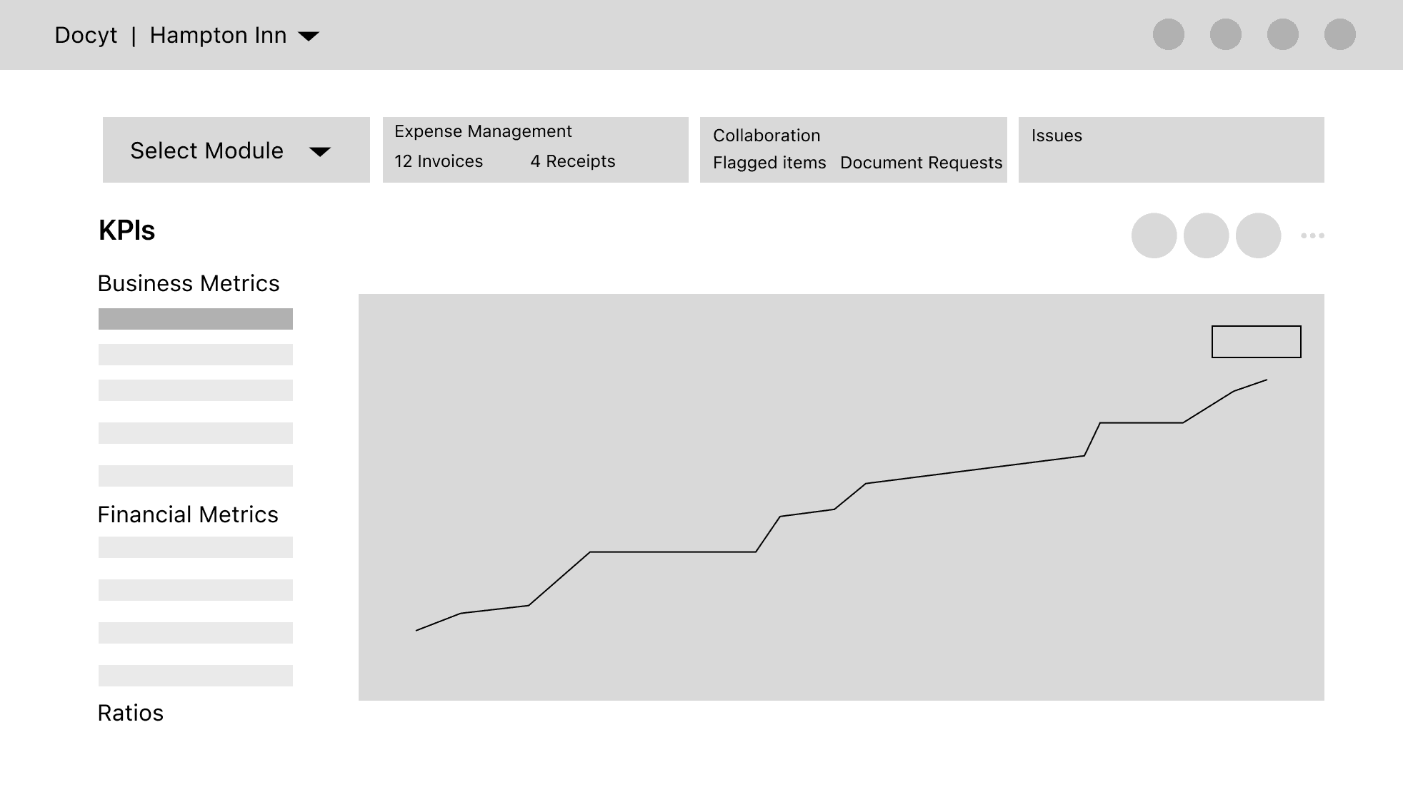
WIDGETS
NAVIGATION
KPIs COMBO
Widget type ideas
Key Highlights
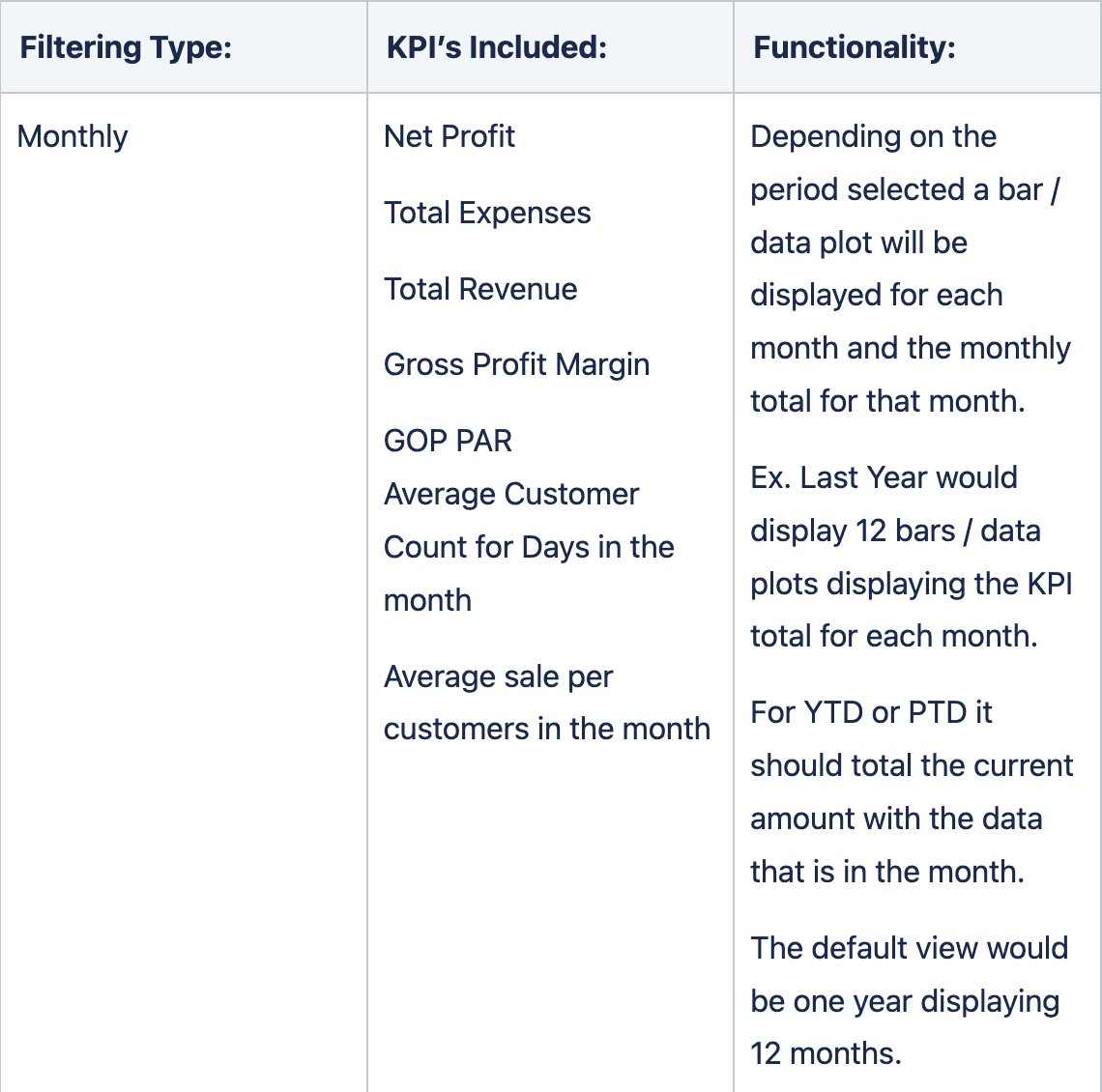
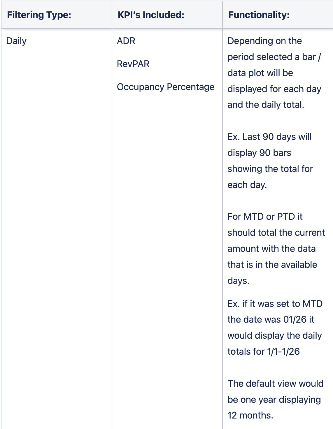
Filtering Documentation
I have designed about
50+ wireframes
Defined different kind of widgets to visualise different KPIs
The leaders weren’t happy with the providing the KPIs list on the left navigation as that real estate is being used for different tabs. This made me to explore a few ideas on the navigation for the whole product.
Leveraging the existing functionalities & layout from existing modules. It can be quickly implemented, I believe.
This year
Last year
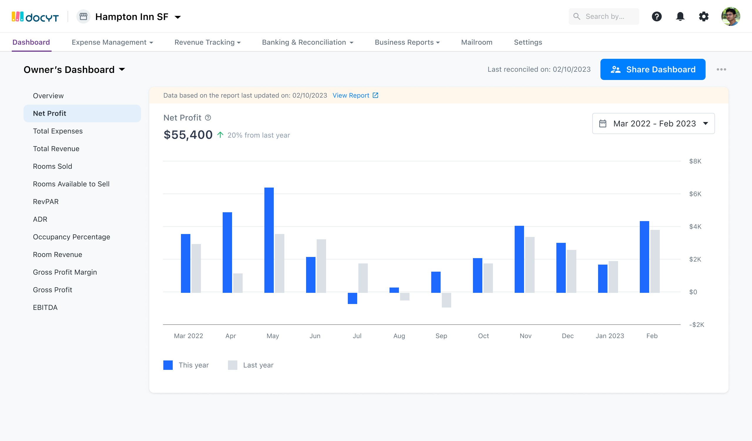
Net Profit
$55,400
20% more than last year’s
JAN
FEB
MAR
APR
MAY
JUN
JUL
AUG
SEP
OCT
NOV
DEC
$80K
$1,000K
$60K
$40K
$20K
$0
April 2022: $60,000
April 2021: $40,000
50%
Year to date (YTD)

AK

JG


+4
Share KPIs
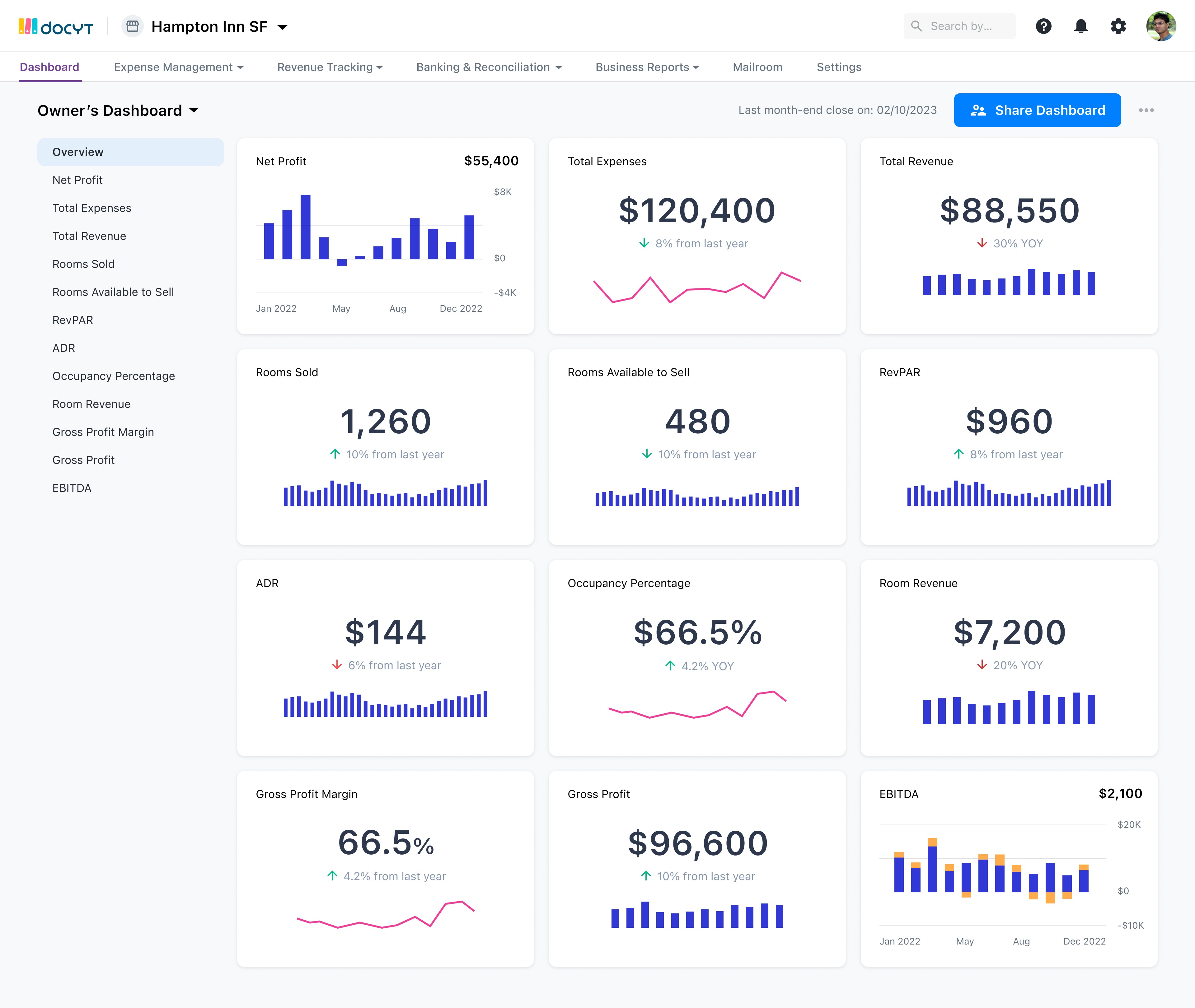
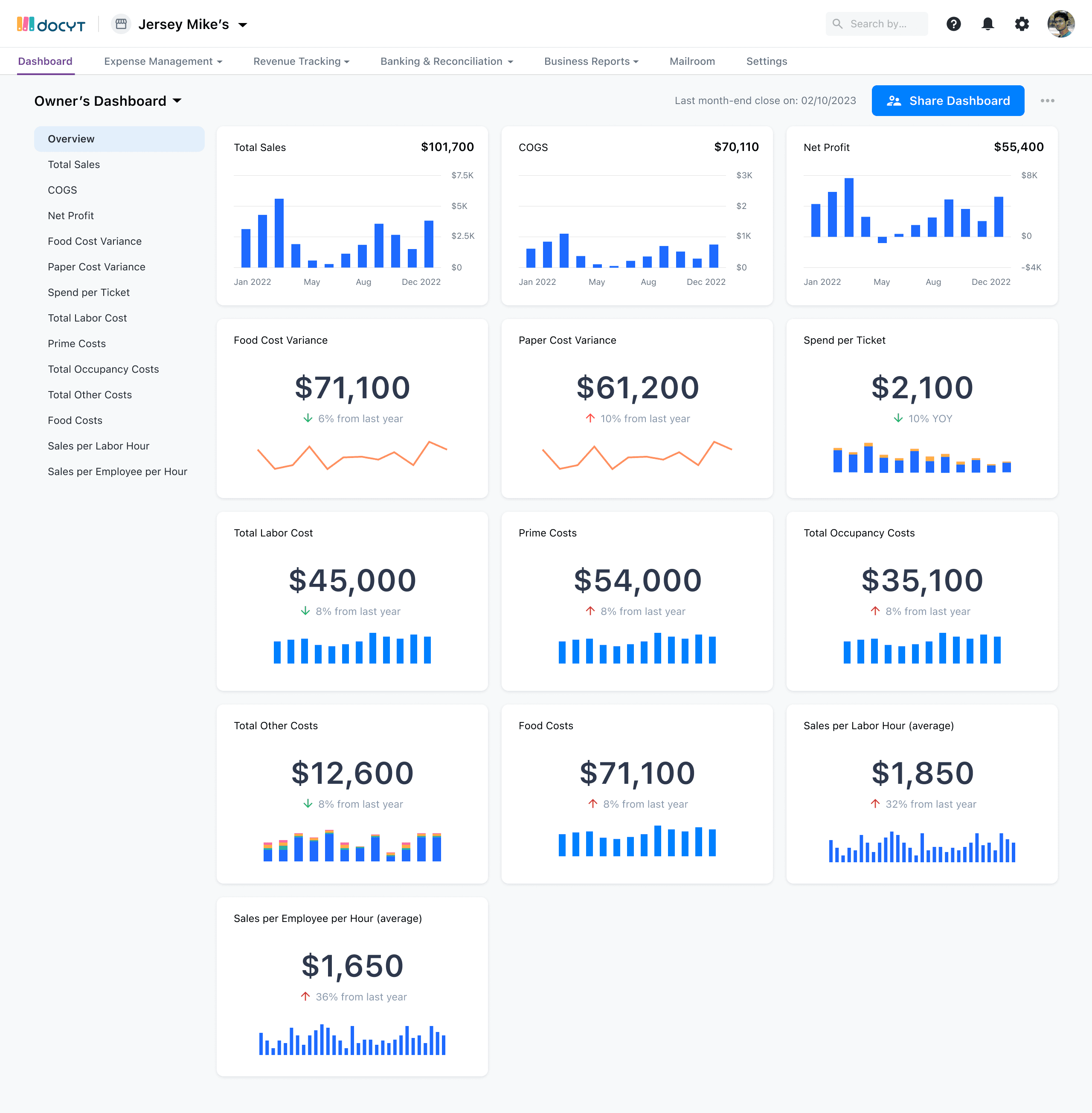
BUSINESS KPIs
Net Profit
Total Expenses
Gross Revenue
AP Aging Report
Gross Profit Margin
FINANCIAL KPIs
RevPAR
ADR
ALOS
MPI
RATIOs
Average Sale per Customer
Mailboxes Occupied %
Shipping Charges per Shipping
Payroll vs Average Gross Sales
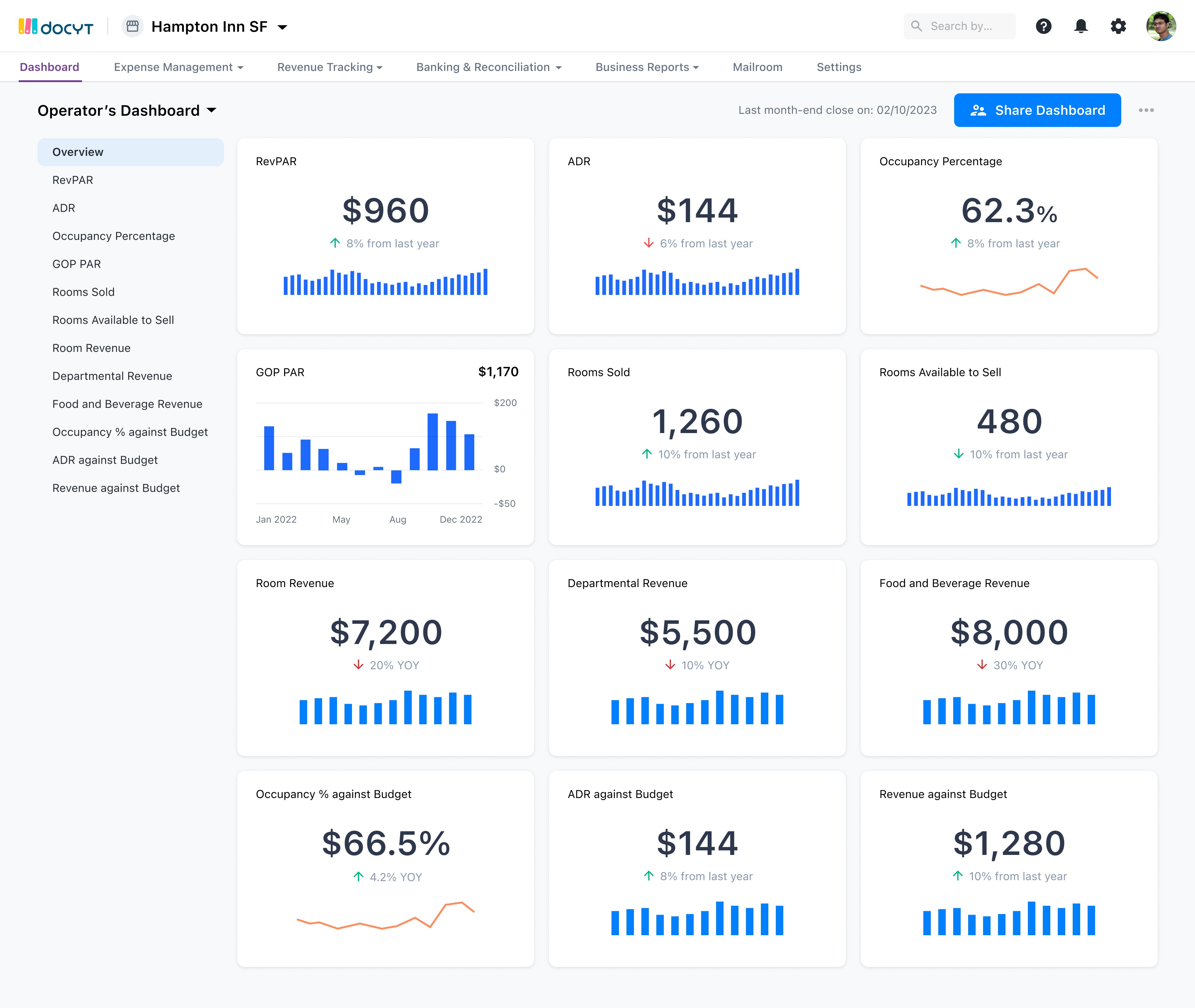
Hampton Inn SF
Search by Transaction Id, description, or amount

KPIs
Bill Pay
Receipt Box
Expense Reports
Vendors
Revenue Center
Accounts Receivable
Banking Accounts
Reconciliation Center
Business Reports
Mailroom
Hampton Inn SF
Search by Transaction Id, description, or amount
Share
KPIs
BUSINESS KPIs
Net Profit
Total Expenses
Gross Revenue
AP Aging Report
Gross Profit Margin
FINANCIAL KPIs
RevPAR
ADR
ALOS
MPI
RATIOs
Average Sale per Customer
Mailboxes Occupied %
Shipping Charges per Shipping
Payroll vs Average Gross Sales
This year
Last year
Net Profit
$55,400
20% more than last year’s
JAN
FEB
MAR
APR
MAY
JUN
JUL
AUG
SEP
OCT
NOV
DEC
$80K
$1,000K
$60K
$40K
$20K
$0
April 2022: $60,000
April 2021: $40,000
50%
Year to date (YTD)
AK
JG
+4
Net Profit
I personally prefer this one because of it’s better visibility of system & it’s scalability.
This one has a much better visibility of all modules & user has an idea what’s current state, and how to move into other modules. But it has some scalability issues
Hampton Inn SF
Search by Transaction Id, description, or amount
AK
JG
+4
Net Profit
KPIs
Bill Pay
Receipt Box
Expense Reports
Vendors
Revenue Center
Accounts Receivable
Banking Accounts
Reconciliation Center
Business Reports
Business Mailroom
Business Setup
This year
Last year
Net Profit
$55,400
20% more than last year’s
JAN
FEB
MAR
APR
MAY
JUN
JUL
AUG
SEP
OCT
NOV
DEC
$80K
$1,000K
$60K
$40K
$20K
$0
April 2022: $60,000
April 2021: $40,000
50%
Year to date (YTD)
BUSINESS KPIs
Net Profit
Total Expenses
Gross Revenue
AP Aging Report
Gross Profit Margin
FINANCIAL KPIs
RevPAR
ADR
ALOS
MPI
RATIOs
Average Sale per Customer
Mailboxes Occupied %
Shipping Charges per Shipping
Payroll vs Average Gross Sales
Share KPIs
Expense Management
12 Invoices
04 Receipts
Collaboration
02 Flagged Items
0 Doc Requests
Issues
Quickbook disconnected
Bank account disconnected
Duplicate transactions
This year
Last year
Net Profit
$55,400
20% more than last year’s
JAN
FEB
MAR
APR
MAY
JUN
JUL
AUG
SEP
OCT
NOV
DEC
$80K
$1,000K
$60K
$40K
$20K
$0
Year to date (YTD)

DC

AK

JG
+5
BUSINESS KPIs
Net Profit
Total Expenses
Gross Revenue
AP Aging Report
Gross Profit Margin
FINANCIAL KPIs
RevPAR
ADR
ALOS
MPI
RATIOs
Average Sale per Customer
Mailboxes Occupied %
Shipping Charges per Shipping
Payroll vs Average Gross Sales
Business Details
Go to Service
Hampton Inn SF
Search by Transaction Id, description, or amount
Final Product
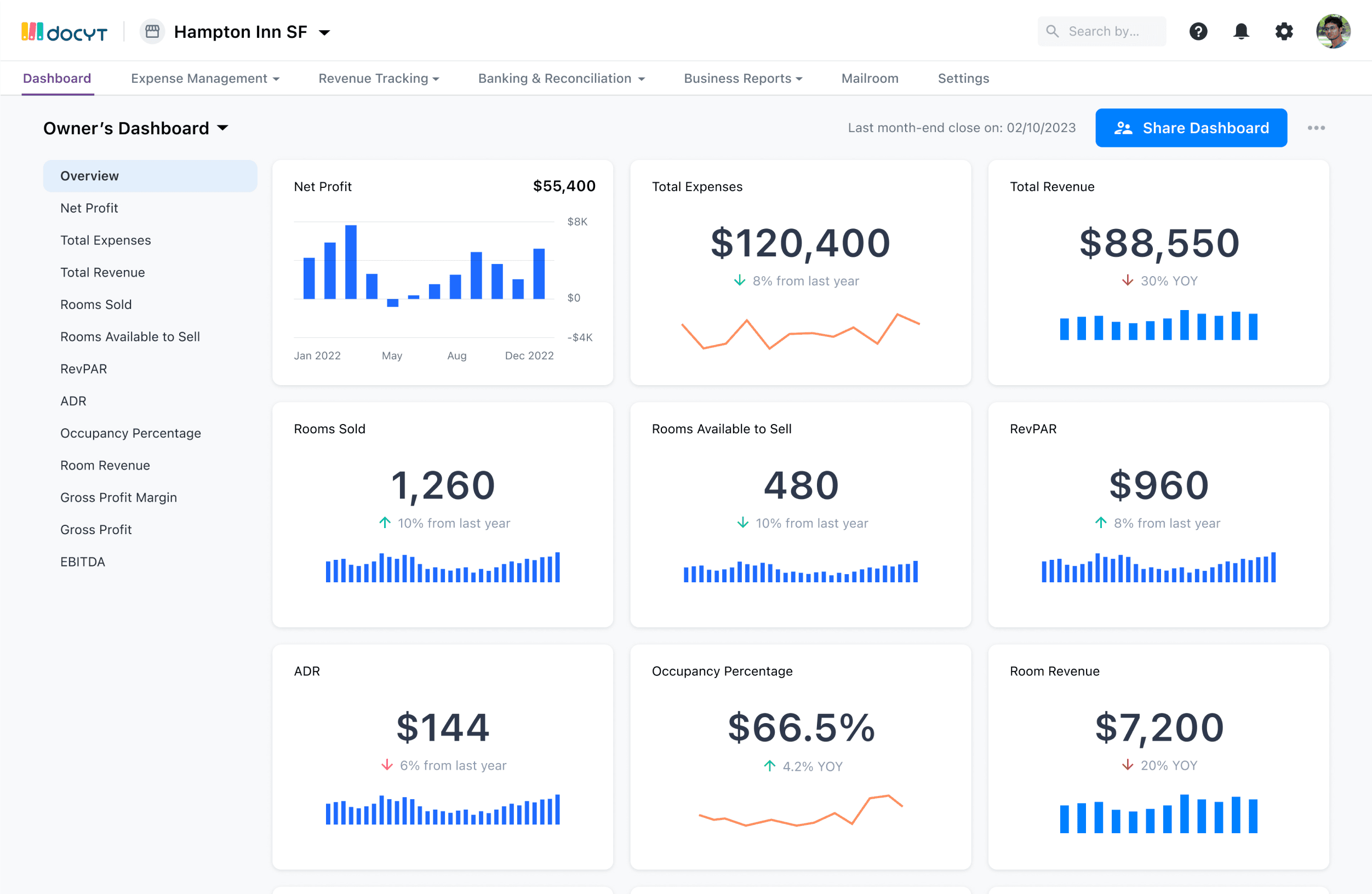
Created a top-notch and intuitive user interface
THE KPIs
THE KPIs
THE KPIs
DIFFERENT STATES
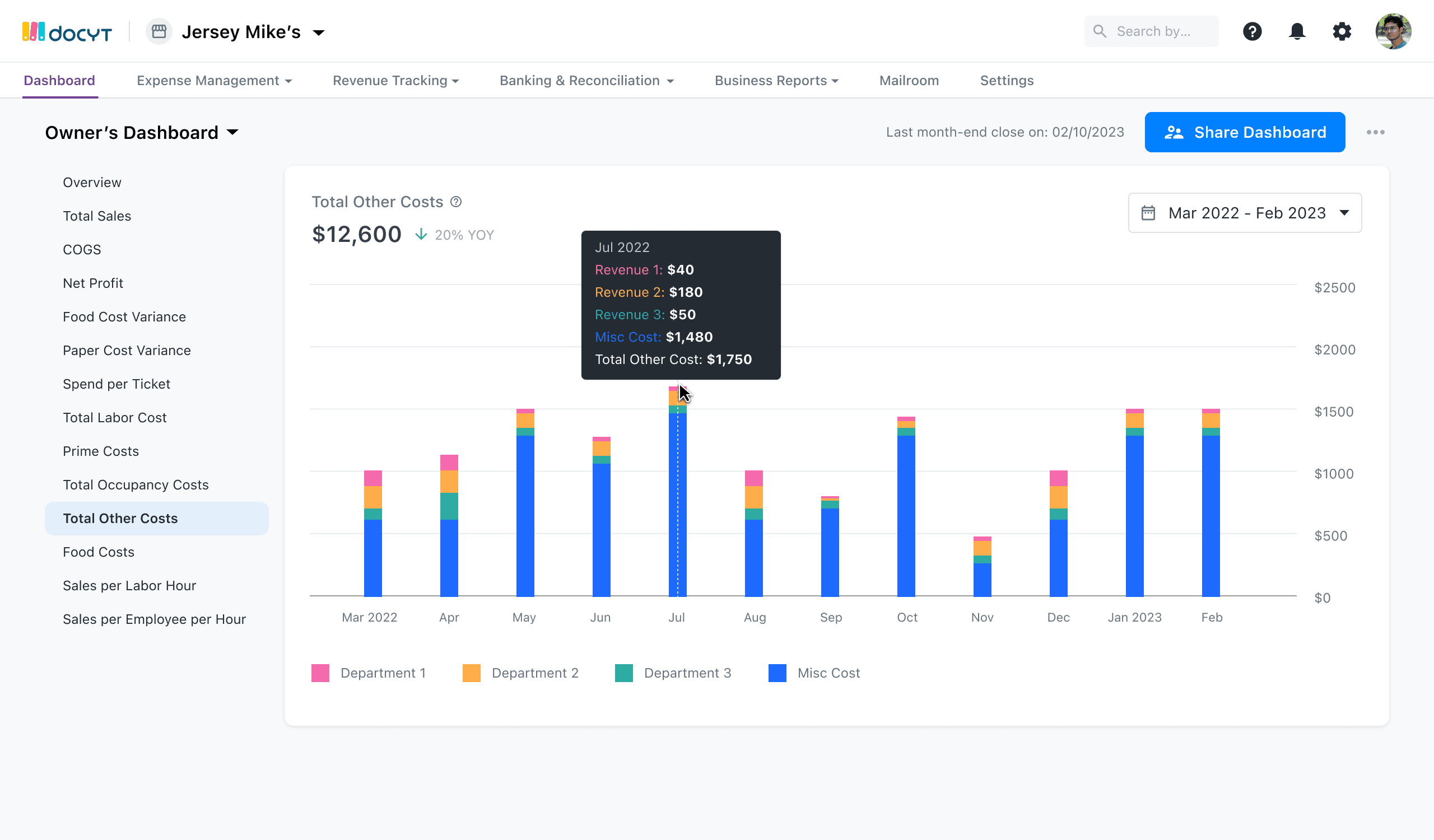
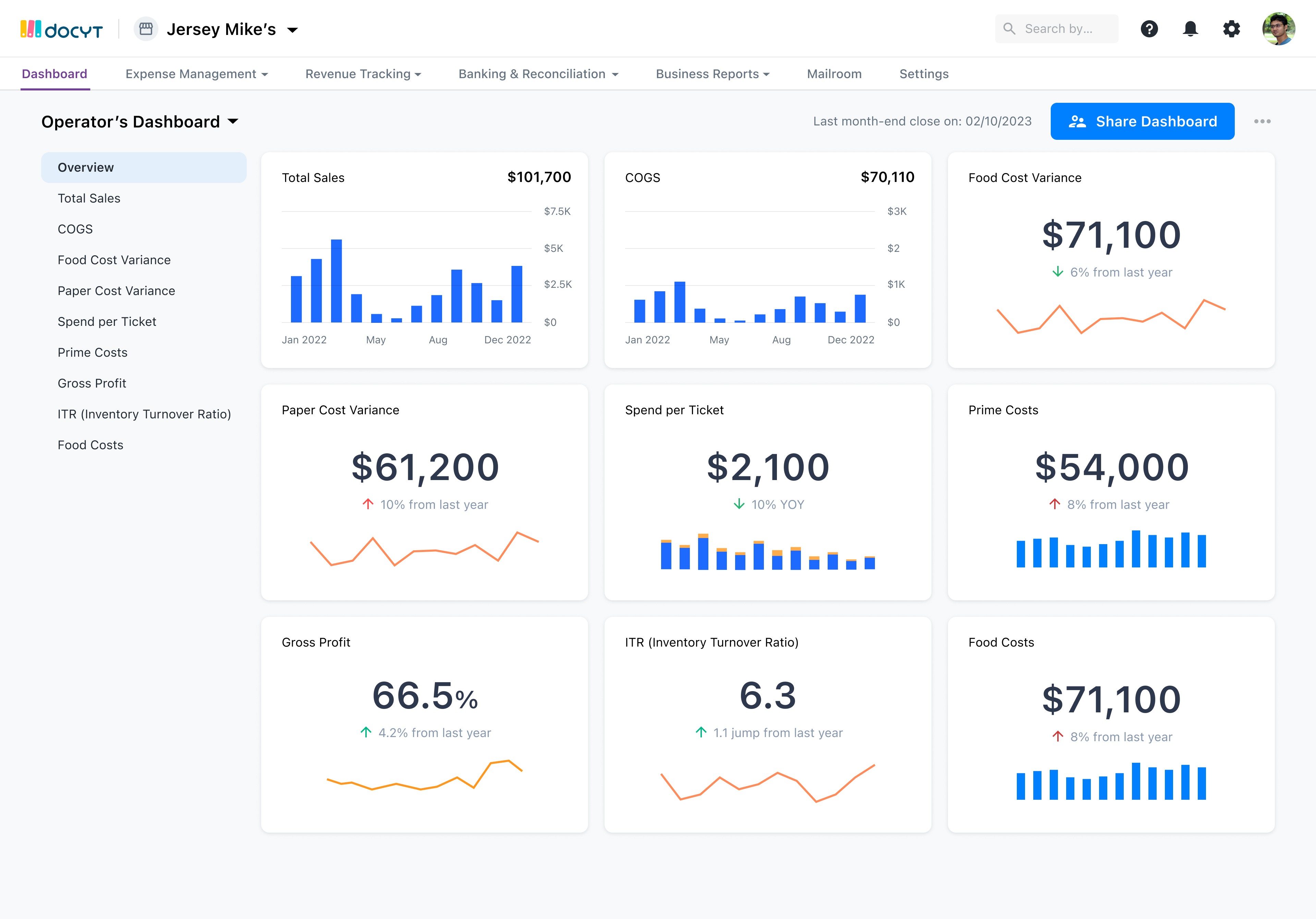
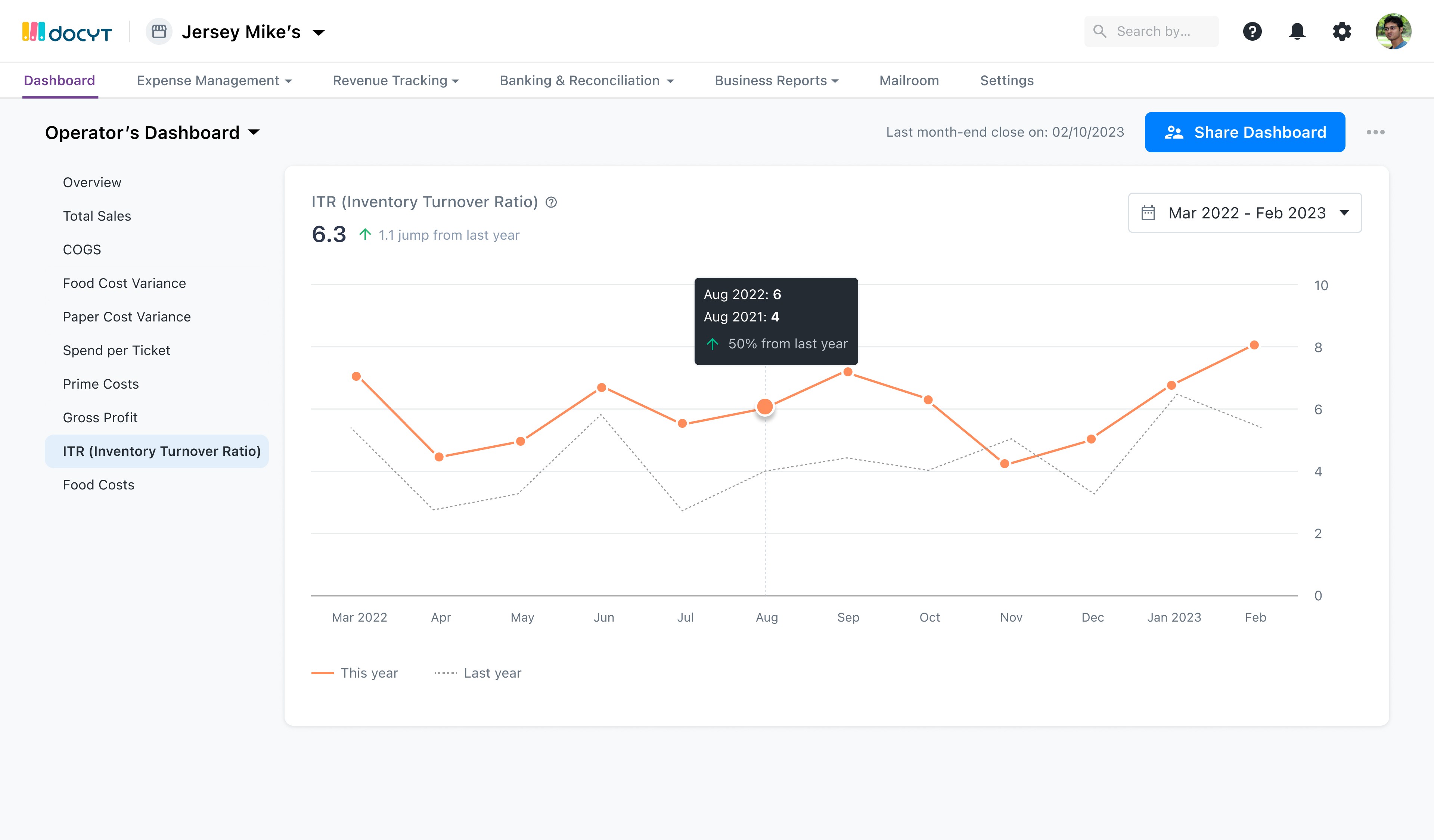
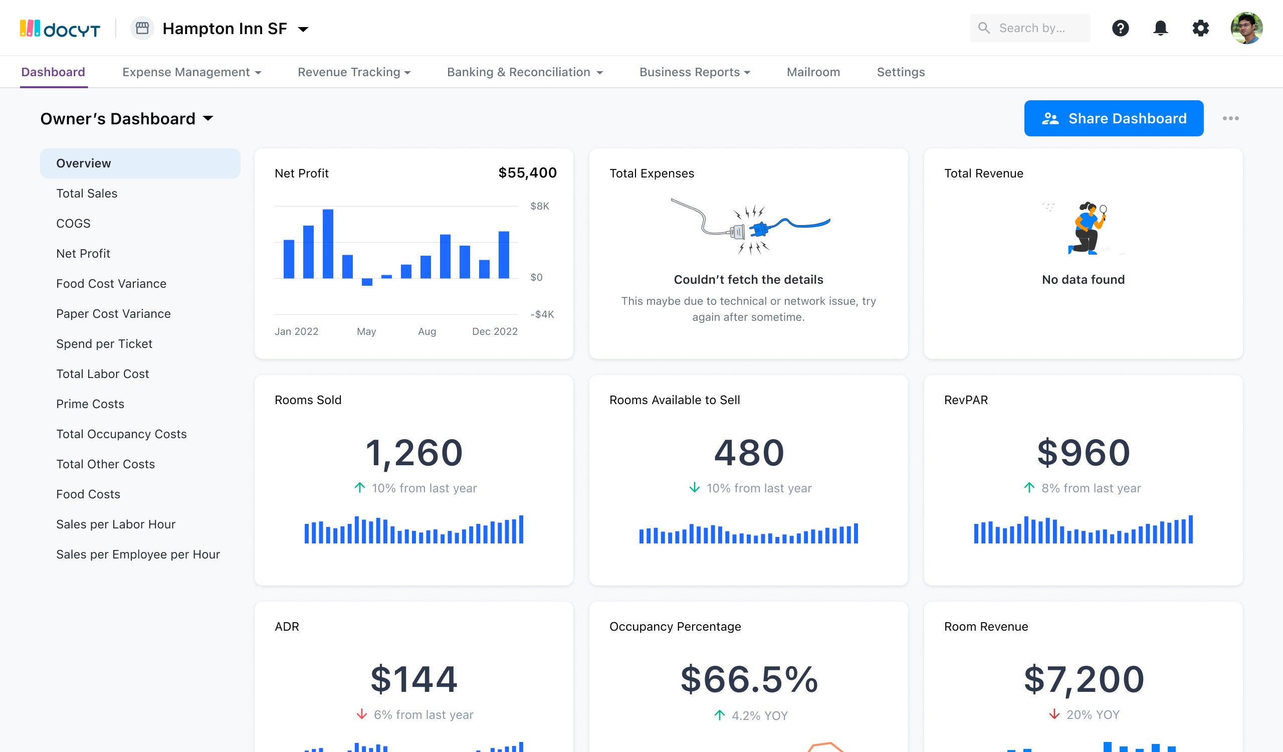
Hospitality KPIs
Quick Service Restaurant (QSR) KPIs
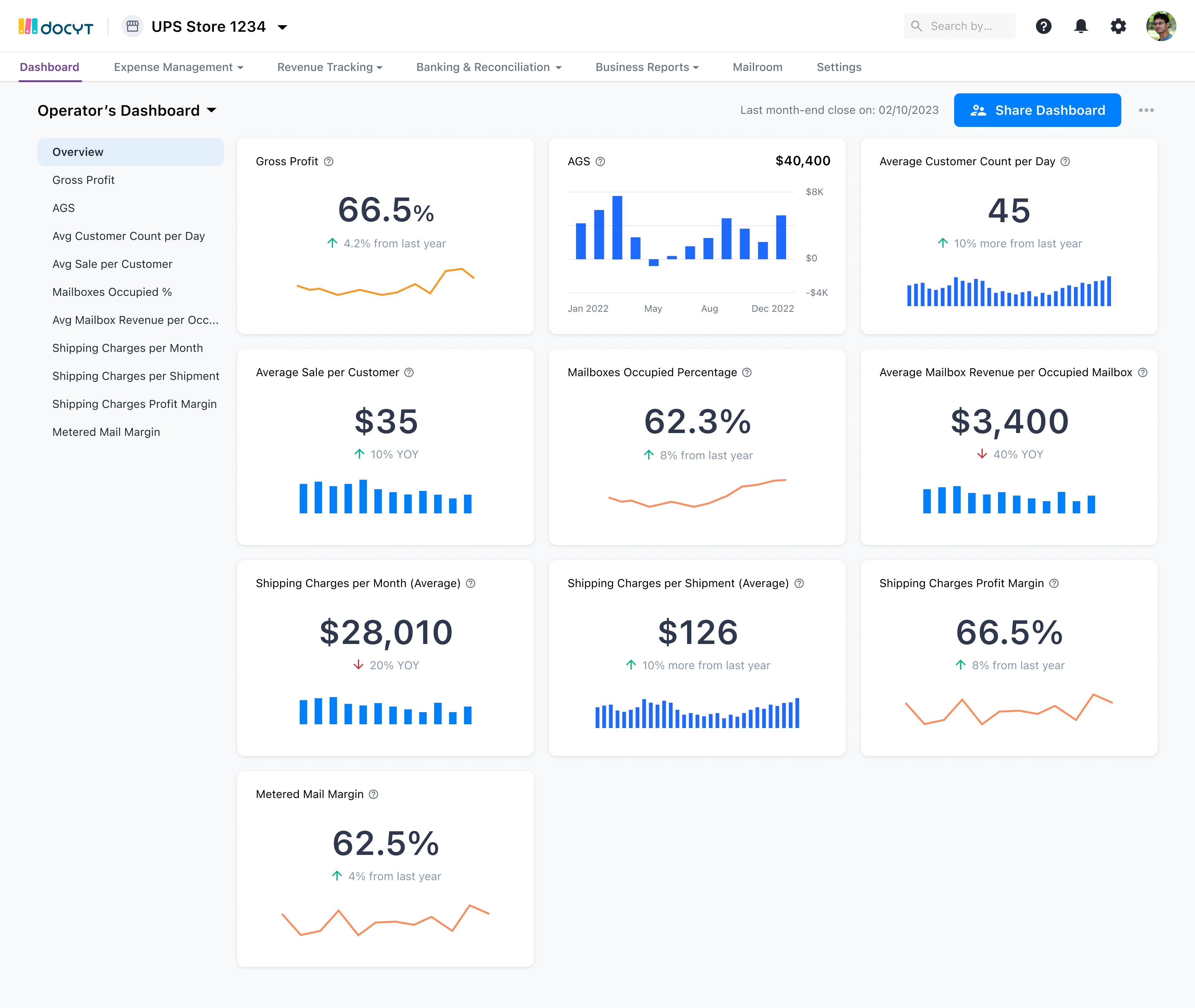
UPS KPIs
The edge cases
A few high-fidelity designs of hospitality KPIs for owner and operator.
A few high-fidelity designs of QSR KPIs for owner and operator.
A few high-fidelity designs of UPS KPIs for owner and operator.
NEXT VERSION
COMING SOON
ABOUT RESULTS
THE END
Enhancements
Multi-entity KPIs view
Outcomes
Thanks
A few that were suggested after the MVP designs that presented above.
As a next step of this project, we are taking it next level. This is still in progress as I document this project. Attaching a few low-fidelity designs for the reference.
If I learned anything, it’s that team alignment is significant. The navigation changes was a big step taken by the team. We couldn’t have built a successful product without all following the same goal.
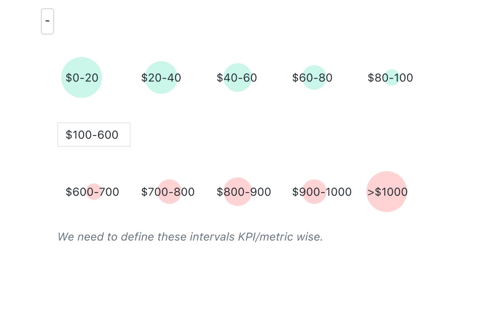
For all revenue, profit, sales related KPIs
For all cost & expense related KPIs
For ratios or percentage
Launched on
time and budget
product/market
fit for docyt
reached our
revenue targets
We successfully launched
on time and started
onboarding early users.
We found the product fit
that increased our sales
significantly.
We successfully launched
it with all our existing plans
and user upgraded the as
they saw the insights on
dashboard.
✌🏼 2023 • Sanjeet Kadyan